Three months
UX/UI/Product Designer
Building upon the UX analysis conducted for another company and the IKO Institute, the project involved crafting wireframes that adhered to a user-centered design approach, highlighting the various interactions users might encounter within the Relynk web app. Following this, the task included producing a comprehensive style guide for the app and creating high-fidelity mockups derived from the wireframes for subsequent user testing and stakeholder evaluation. Continuous coordination with the IKO Institute and its developers was essential throughout the process.
The client needed a solution to enhance operational reliability and communication across departmental interfaces, addressing common frustrations when departments lack the resources or information needed to complete their tasks effectively.
The challenge was to create a platform that would enable departments to clearly communicate and coordinate their requirements for seamless collaboration. Traditional methods, like constant follow-ups and phone calls, were inefficient and often led to delays.
The research phase employed both qualitative and quantitative methods to gather comprehensive insights into user needs and market dynamics.
By analyzing existing UX data, conducting competitive analysis, gathering employee feedback and stakeholder insights, and performing market benchmarking, the process ensured a robust foundation for Relynk’s development.
1. Analysis of Existing UX Data
The initial stage involved a comprehensive analysis of the company’s existing UX data specific to the project. This foundational step aimed to identify current strengths and weaknesses, providing insights into user behaviors and needs.
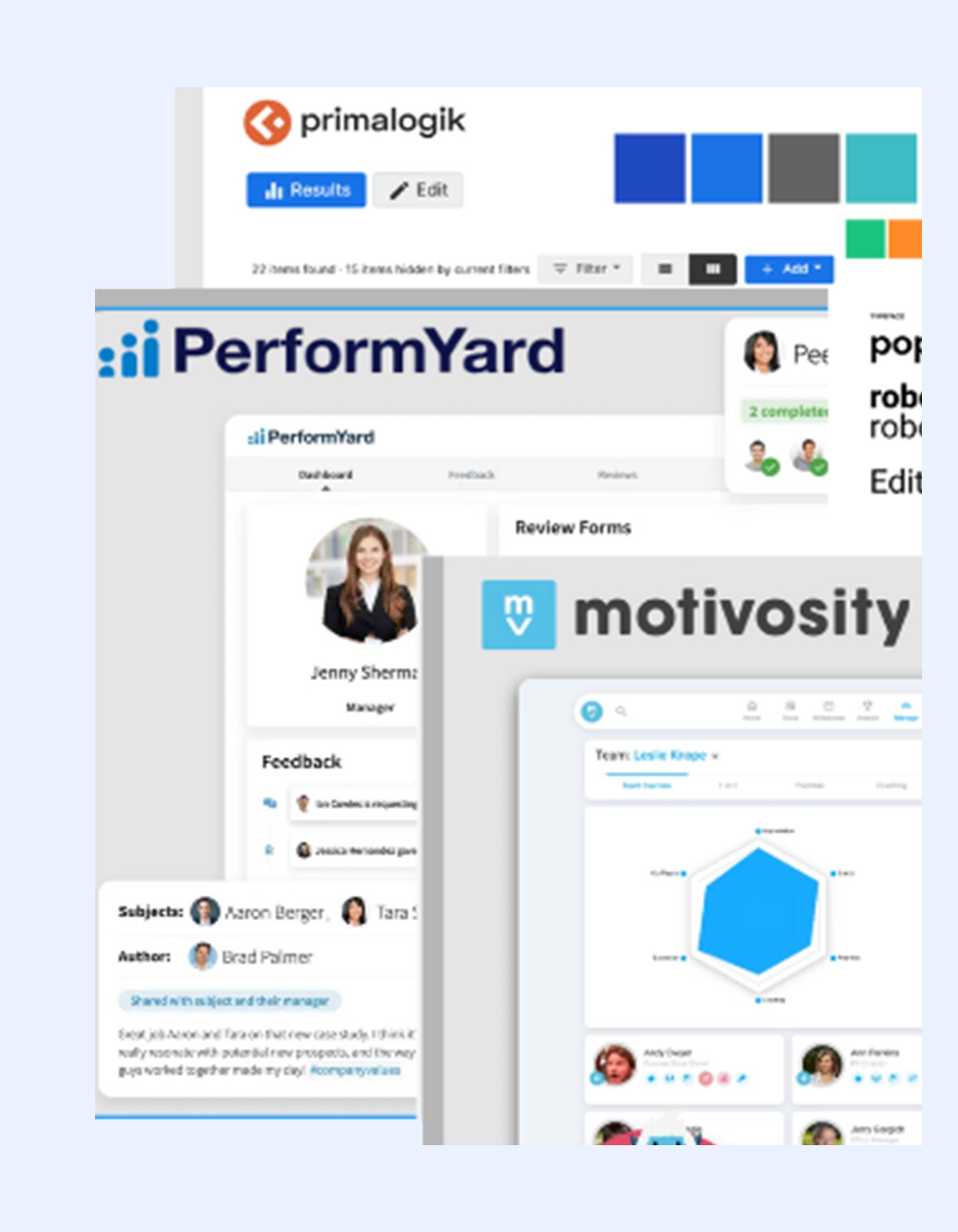
2. Competitive Analysis
Following the initial analysis, a competitive analysis was conducted to gather insights from similar applications in the market. This included evaluating their features, user interfaces, and overall user experiences, allowing for a contextual understanding of industry standards and best practices.

3. Secondary Research and Stakeholder Interviews
This stage incorporated secondary research focused on employee feedback regarding existing collaboration tools. Alongside this, interviews were conducted with key stakeholders involved in the project. Insights gathered highlighted specific pain points, preferences, and requirements from both employees and stakeholders.
4. Market and Industry Benchmarking
The findings of this stage of the research indicate that Relynk should focus on delivering a user-friendly, customizable platform with robust real-time collaboration features, secure document sharing, and a flexible, tiered pricing model to meet diverse user needs and remain competitive in the market.

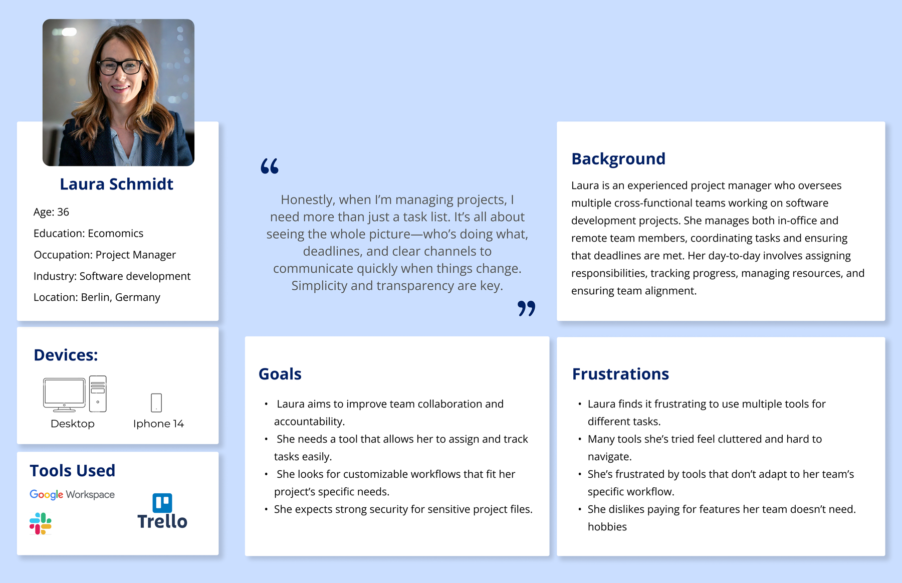
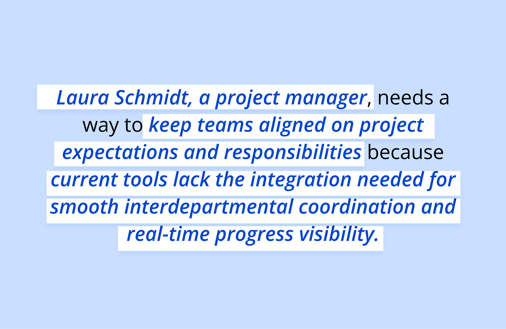
In the Define Phase of Relynk, the problem statement and user persona were refined using insights from both the recent research and legacy UX data inherited from a previous designer’s work on the project.
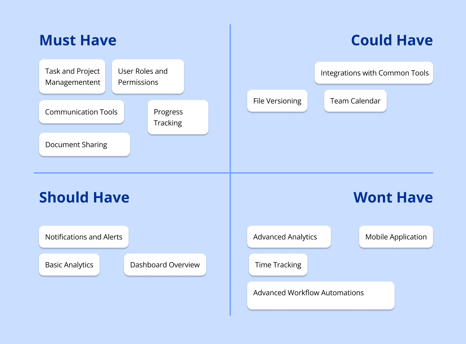
An MVP was carefully prioritized with the MoSCoW Method, and the core architecture and user flows were mapped to ensure an intuitive, user-centered experience. This phase laid a solid foundation focused on addressing primary user needs with essential features and a streamlined design.

Refining the Persona
The Persona was remade to ensure it accurately reflected user needs and pain points, based on both inherited UX data from previous research and fresh insights gathered during recent interviews and analysis.
This refinement allowed for a more precise alignment with real user expectations and challenges.
Refining the Problem Statement
By incorporating insights from the inherited UX data along with fresh findings from competitive analysis, employee feedback, and stakeholder interviews, the updated problem statement provided a clear focus on Relynk’s purpose.
Moscow method & MVP
The Relynk MVP is designed to deliver essential project and task management, real-time tracking, and basic communication features, creating a streamlined tool for team coordination and accountability. Prioritized using the MoSCoW method, it focuses on core functionalities, setting a solid foundation for future enhancements and integrations.
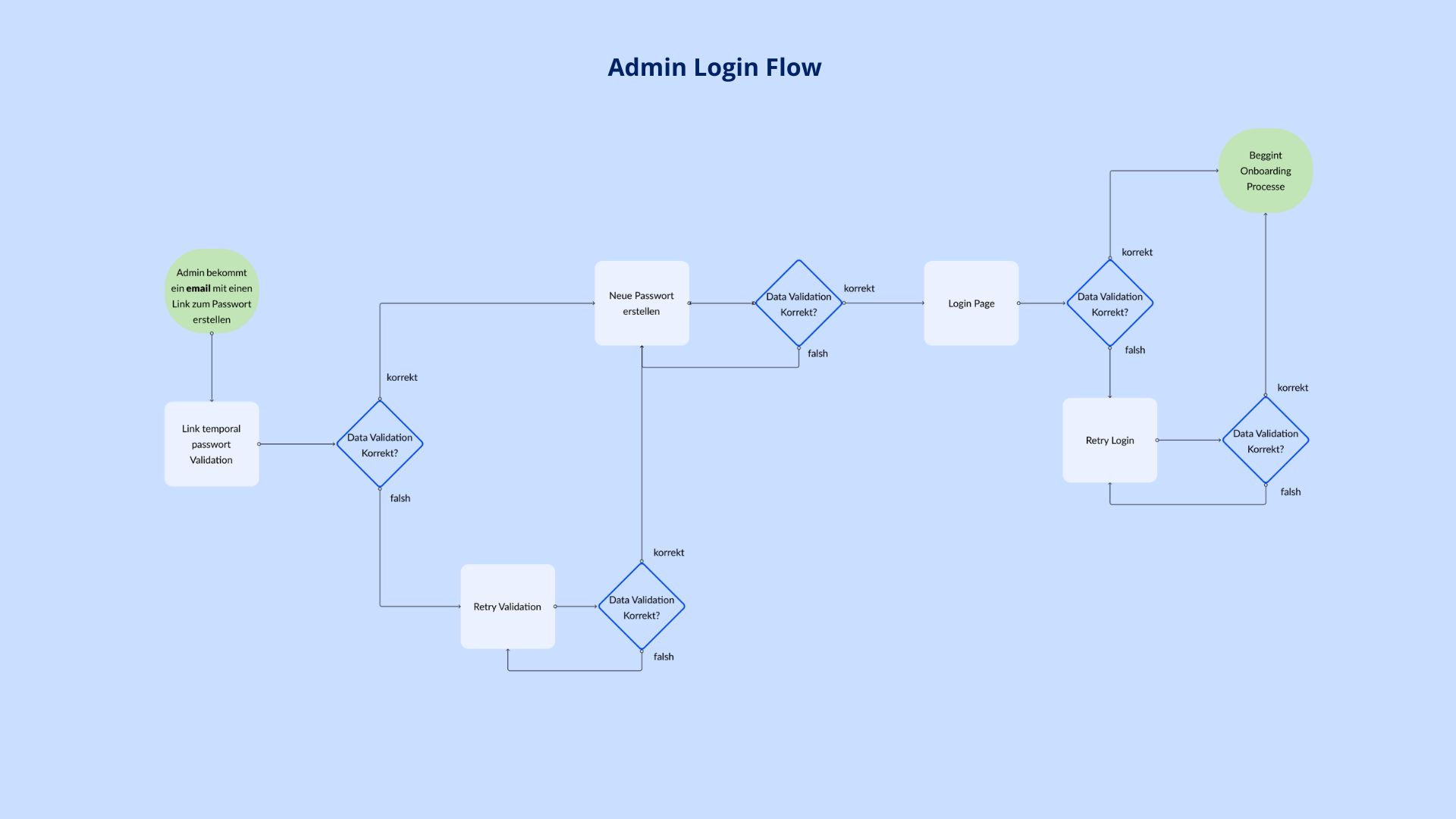
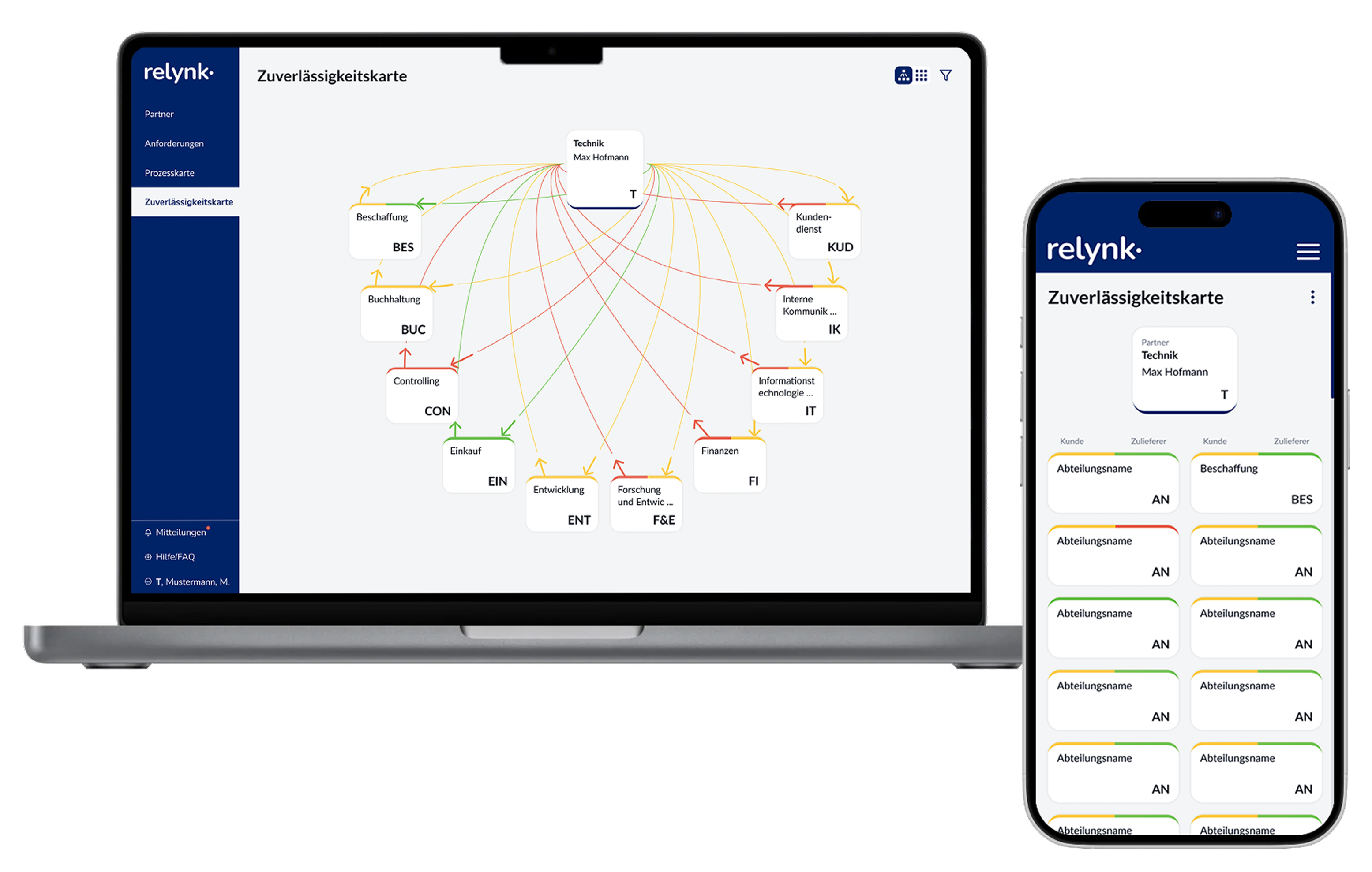
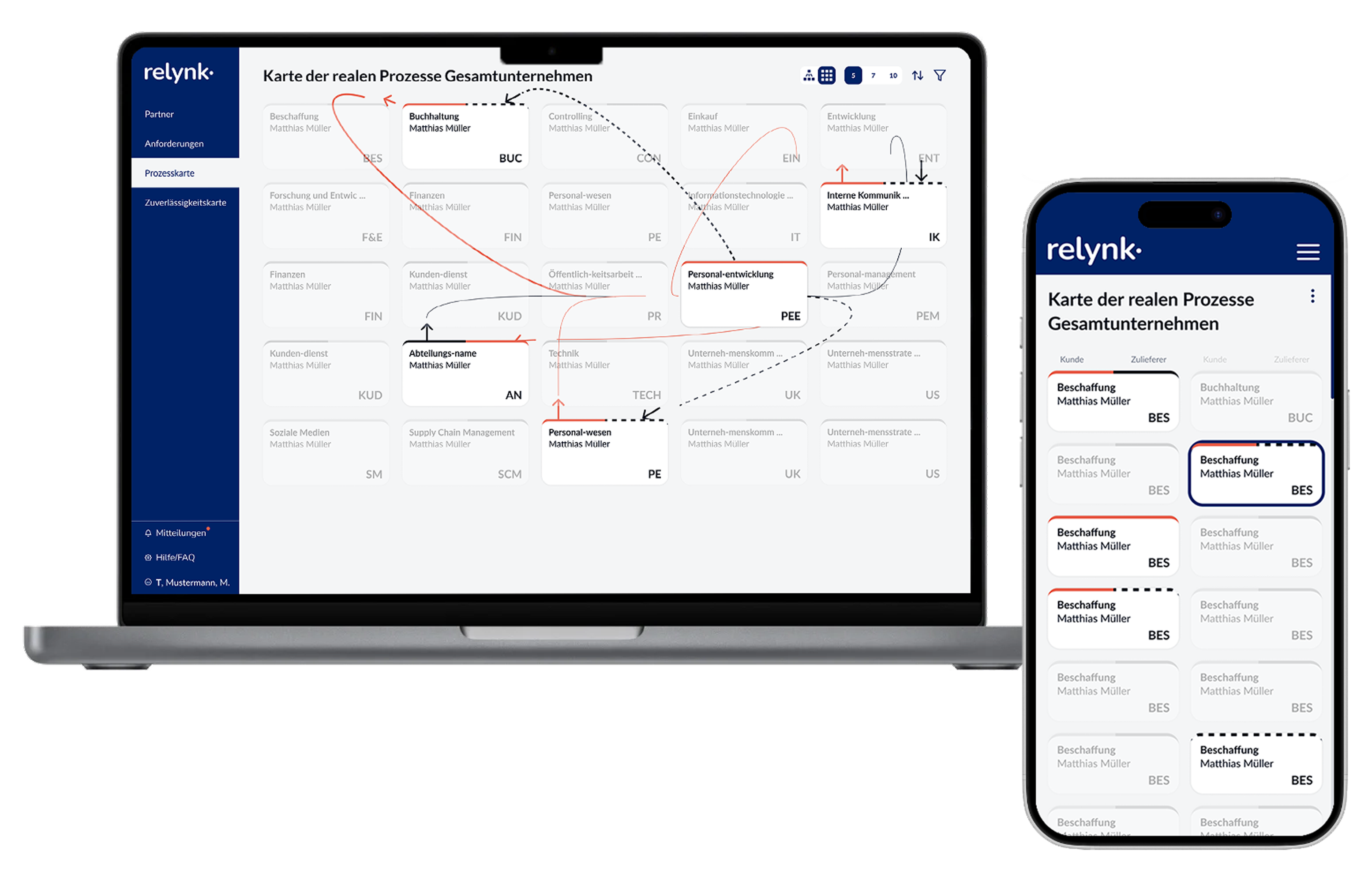
Scalable Architecture with Modular Workflows
The design architecture of Relynk was developed in tandem with key user flows, ensuring an intuitive experience that aligns with how users interact with each feature. Here an example:
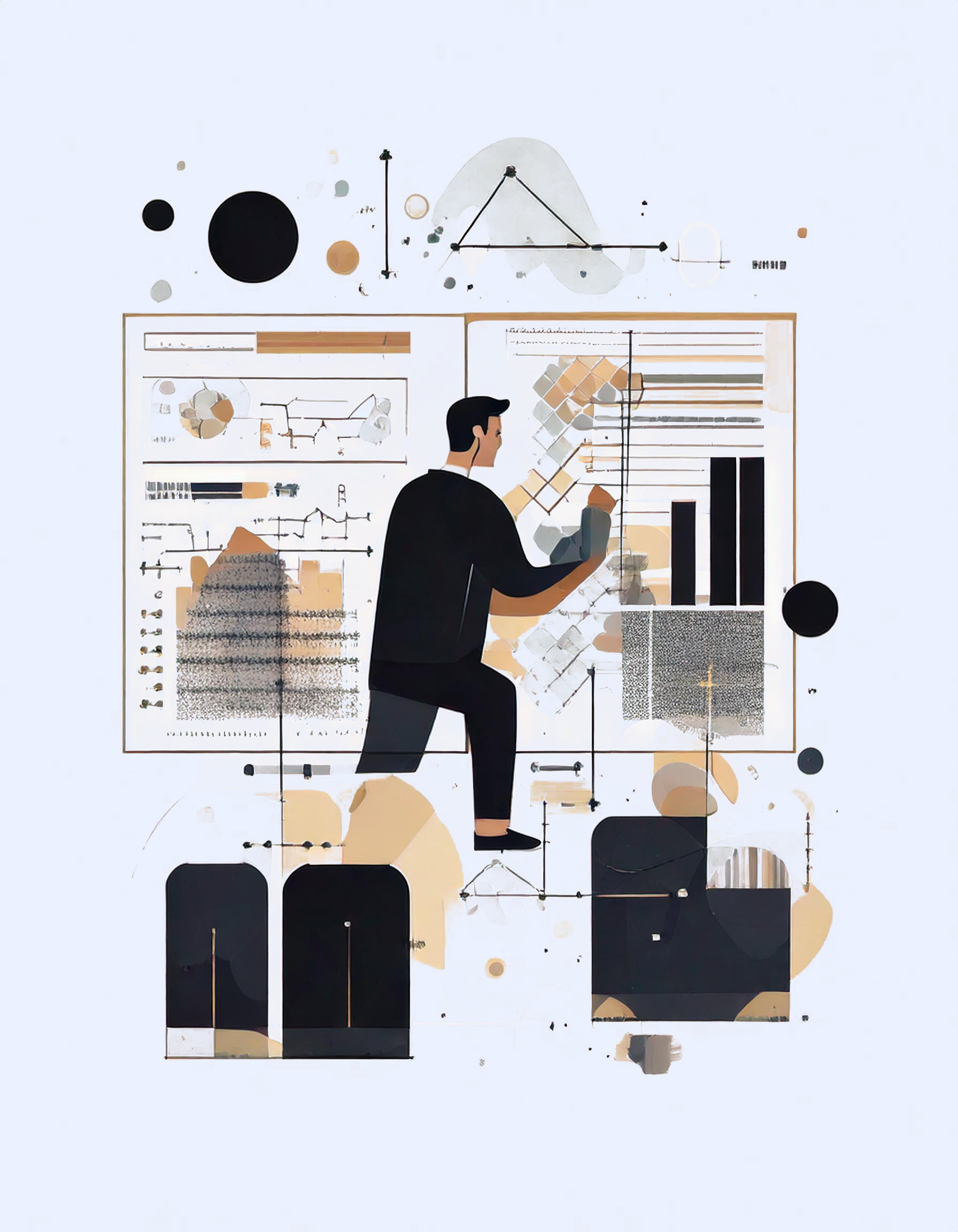
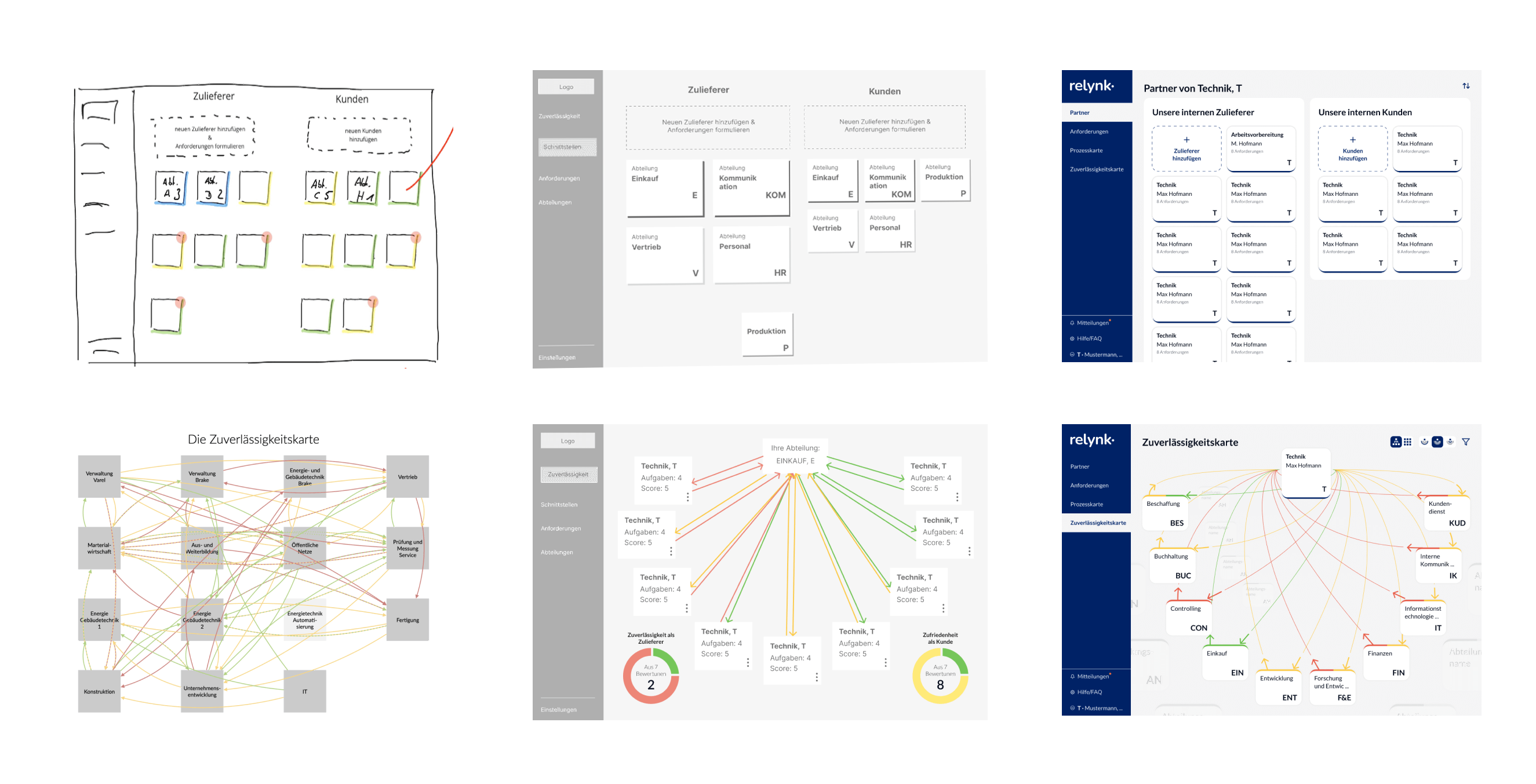
In the Ideate Phase of the Relynk project, the design process moved into brainstorming and conceptualization, focusing on how to best solve the key challenges identified in the Define Phase.
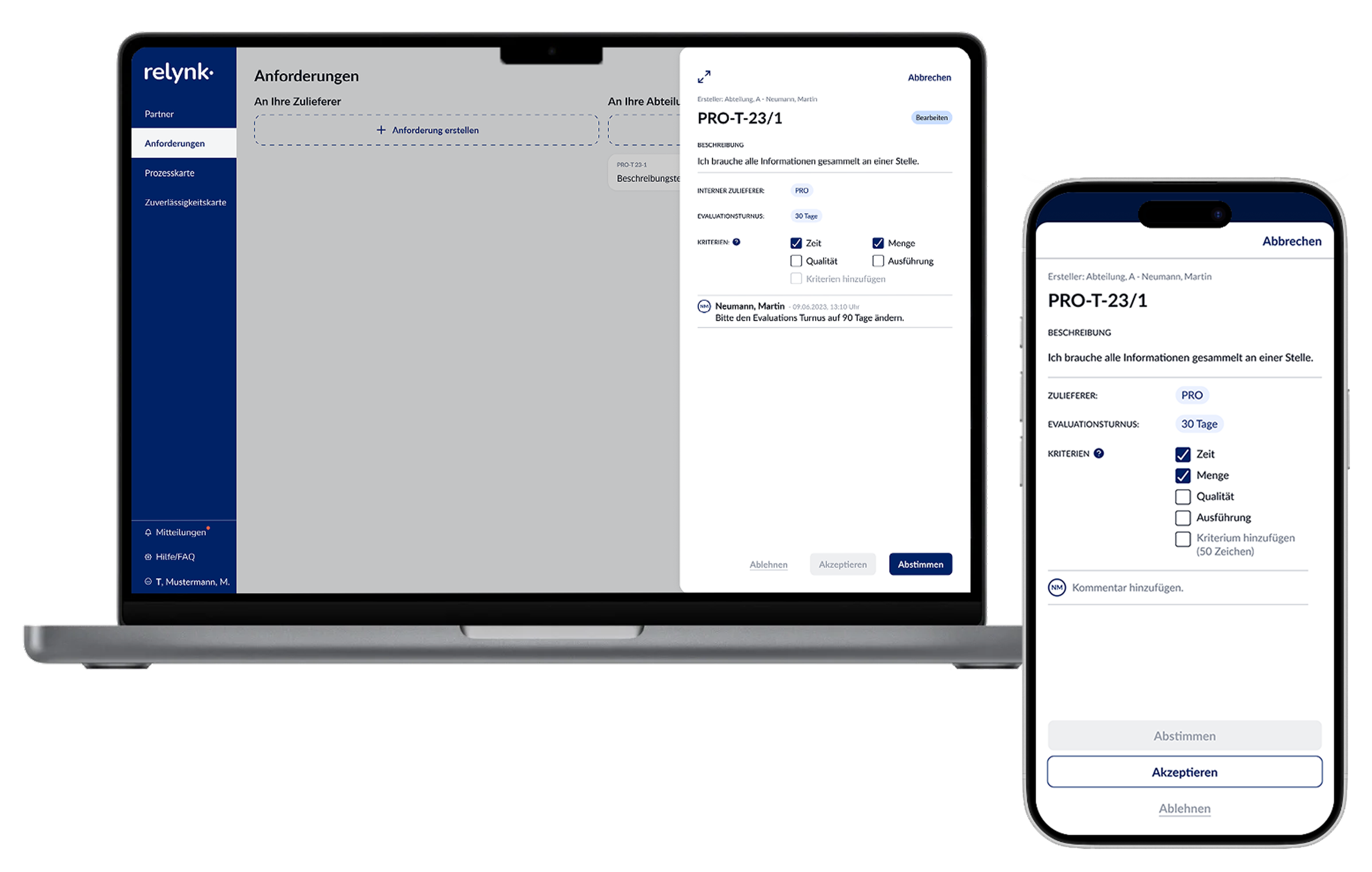
This phase involved creating user flows to map out essential interactions, followed by low-fidelity wireframes to outline the interface structure.

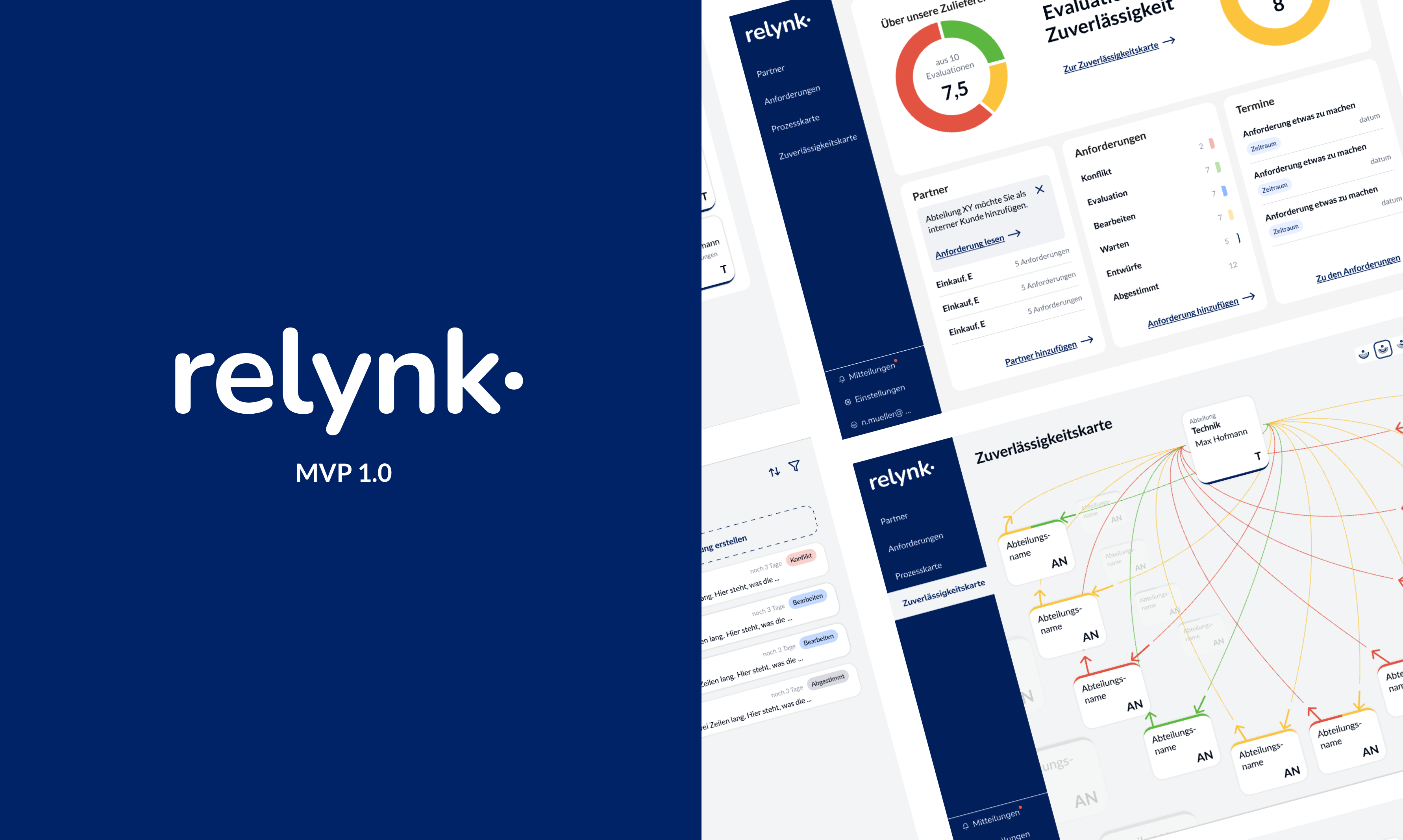
Wireframing for Relynk was conducted in Figma, focusing on key app features such as Dashboard and Process map.
This streamlined workflow enabled rapid iteration and real-time feedback, building a clear, intuitive foundation for the final design
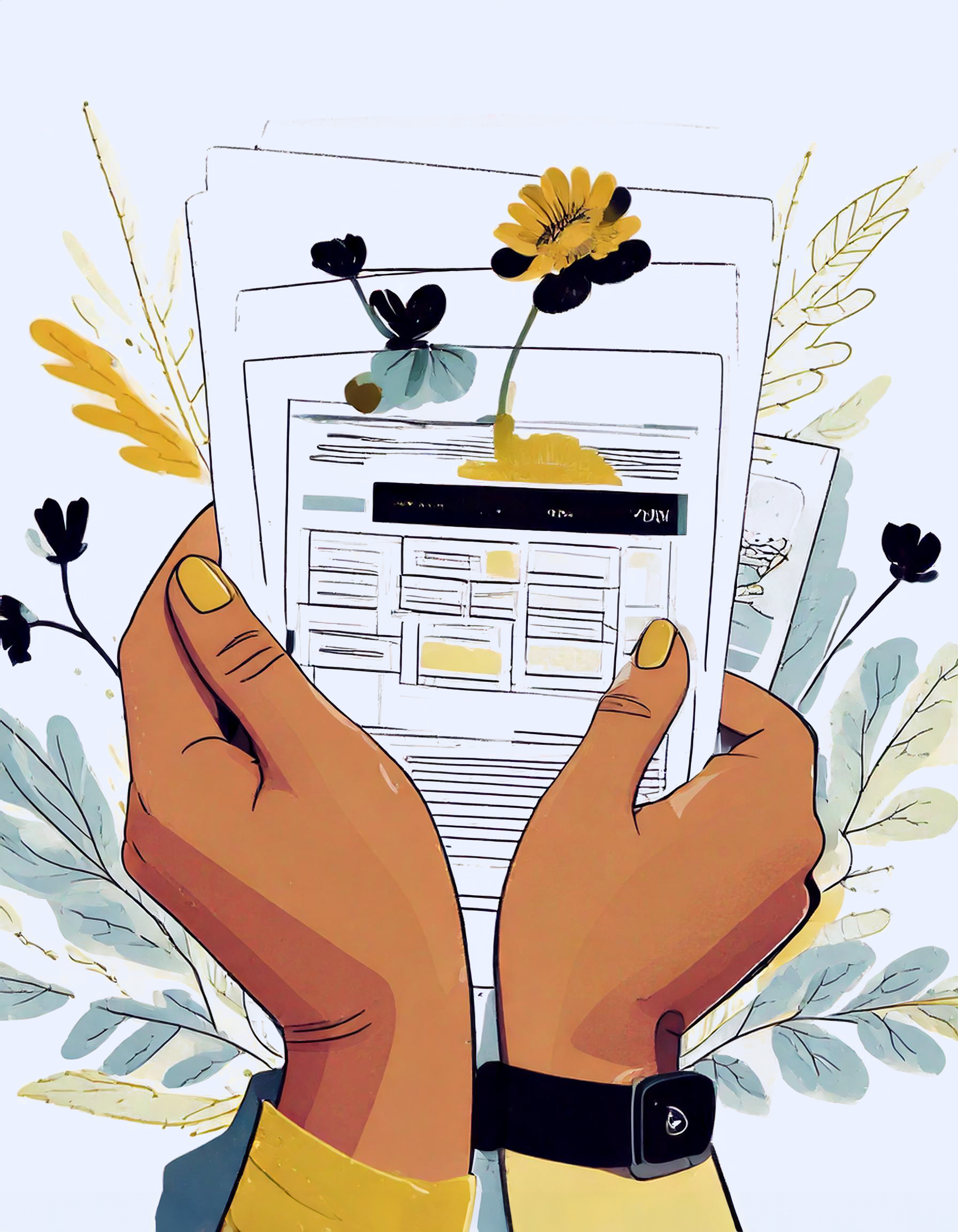
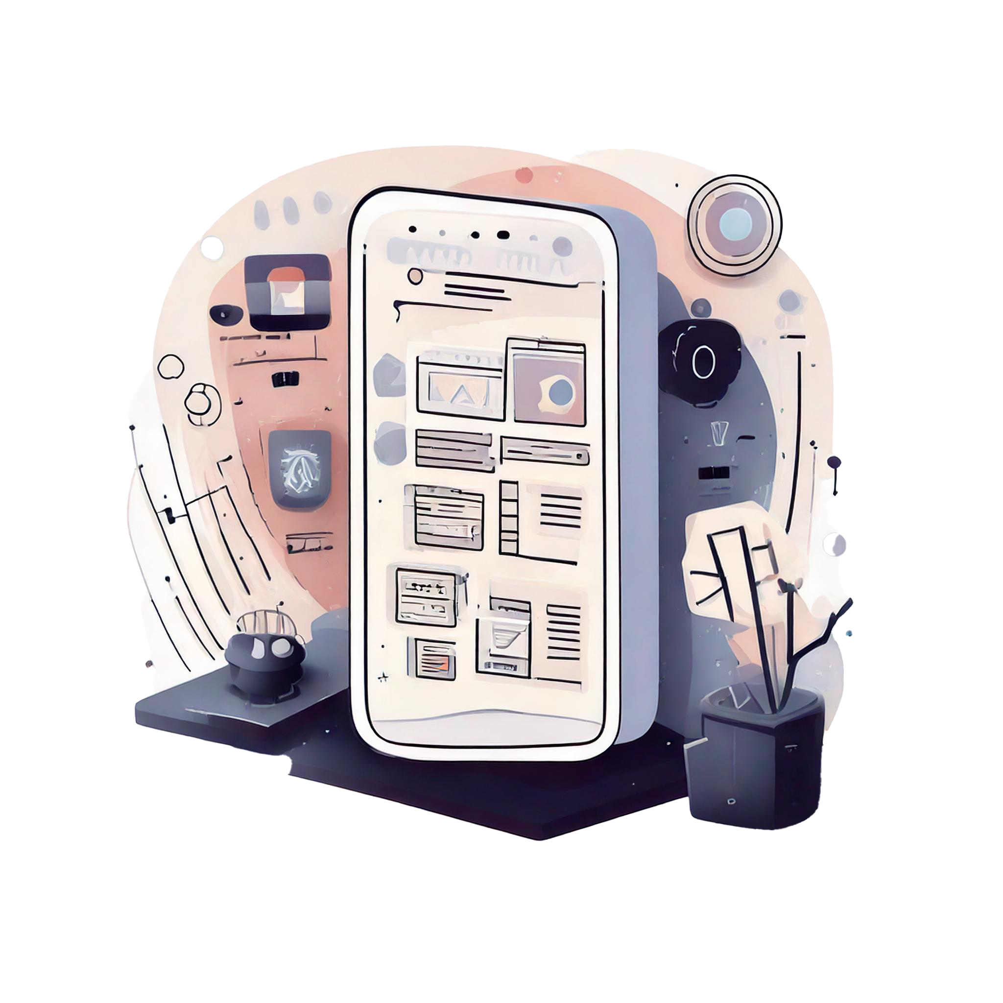
In the Visual and UI Design Phase of Relynk, a cohesive style guide was developed to ensure consistent and engaging design elements across the app.
This guide was shaped by the brand’s core attributes and visual inspiration drawn from a moodboard and style tile, setting the tone for color schemes, typography, iconography, and interactive elements.
Brand Attributes and Moodboard
The brand identity of Relynk is rooted in a composed, elegant, and collaborative aesthetic that balances simplicity with professionalism.
A moodboard helped translate these values into a visual style that supports a clear, intuitive interface while fostering a sense of calm and teamwork, setting the tone for Relynk’s design and user experience.

Strategic Calm
Understated Elegance
Restraint
Collaboration
Motivating
Analytic
Reliable
Professional
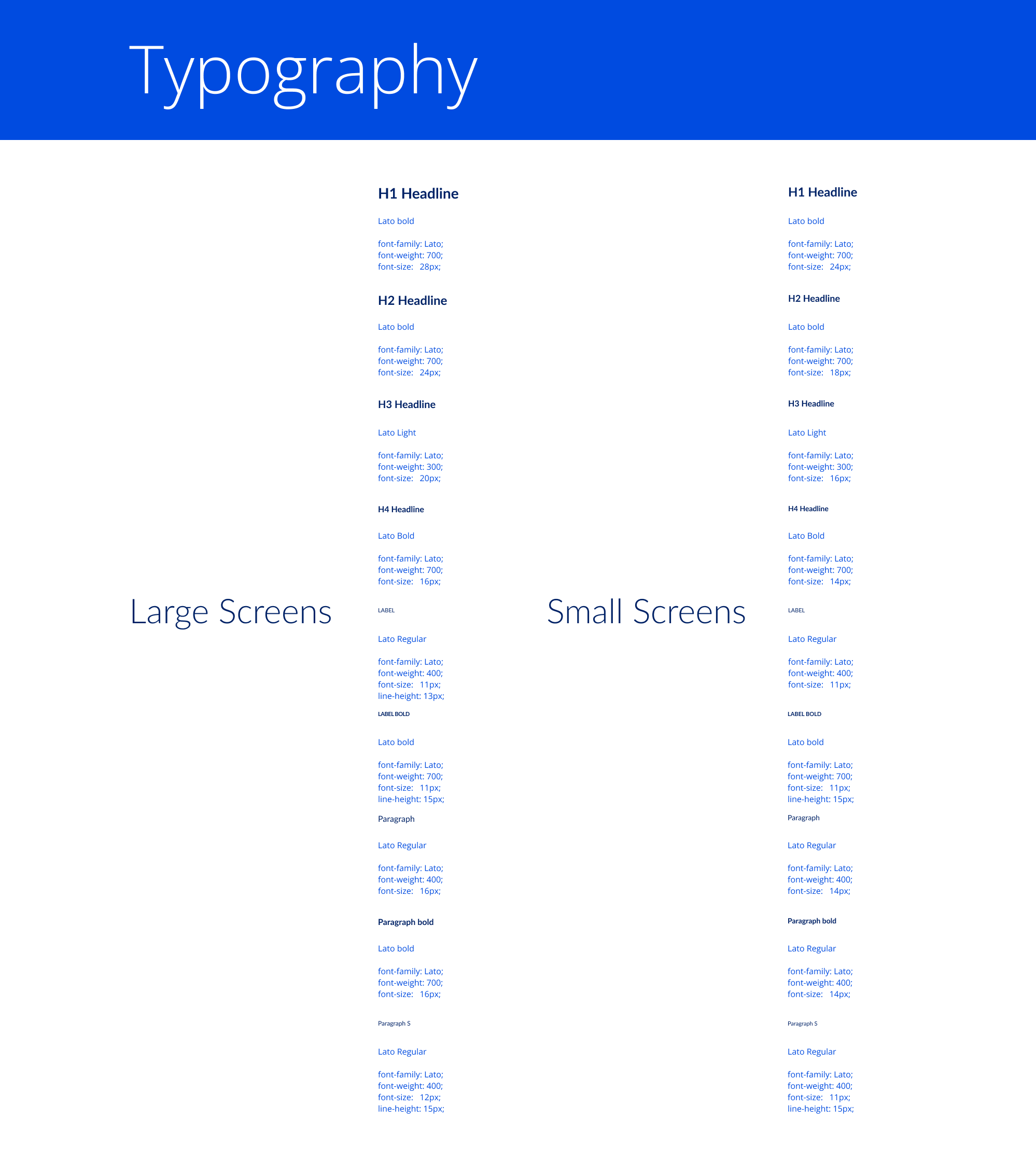
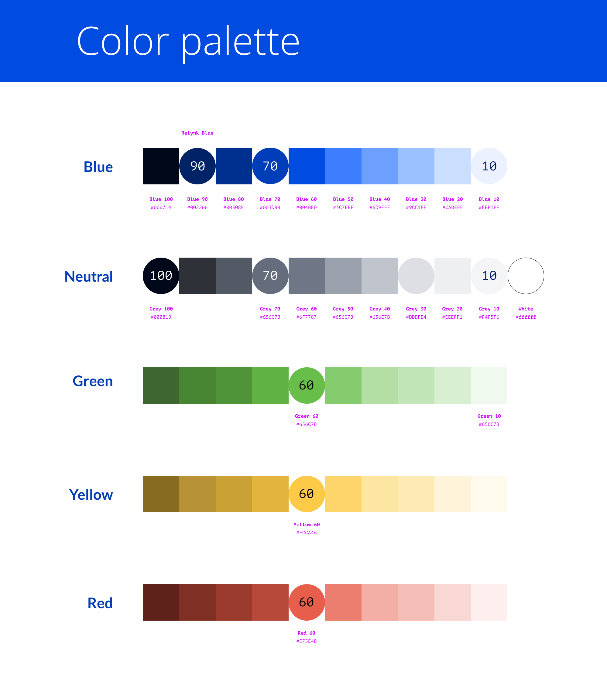
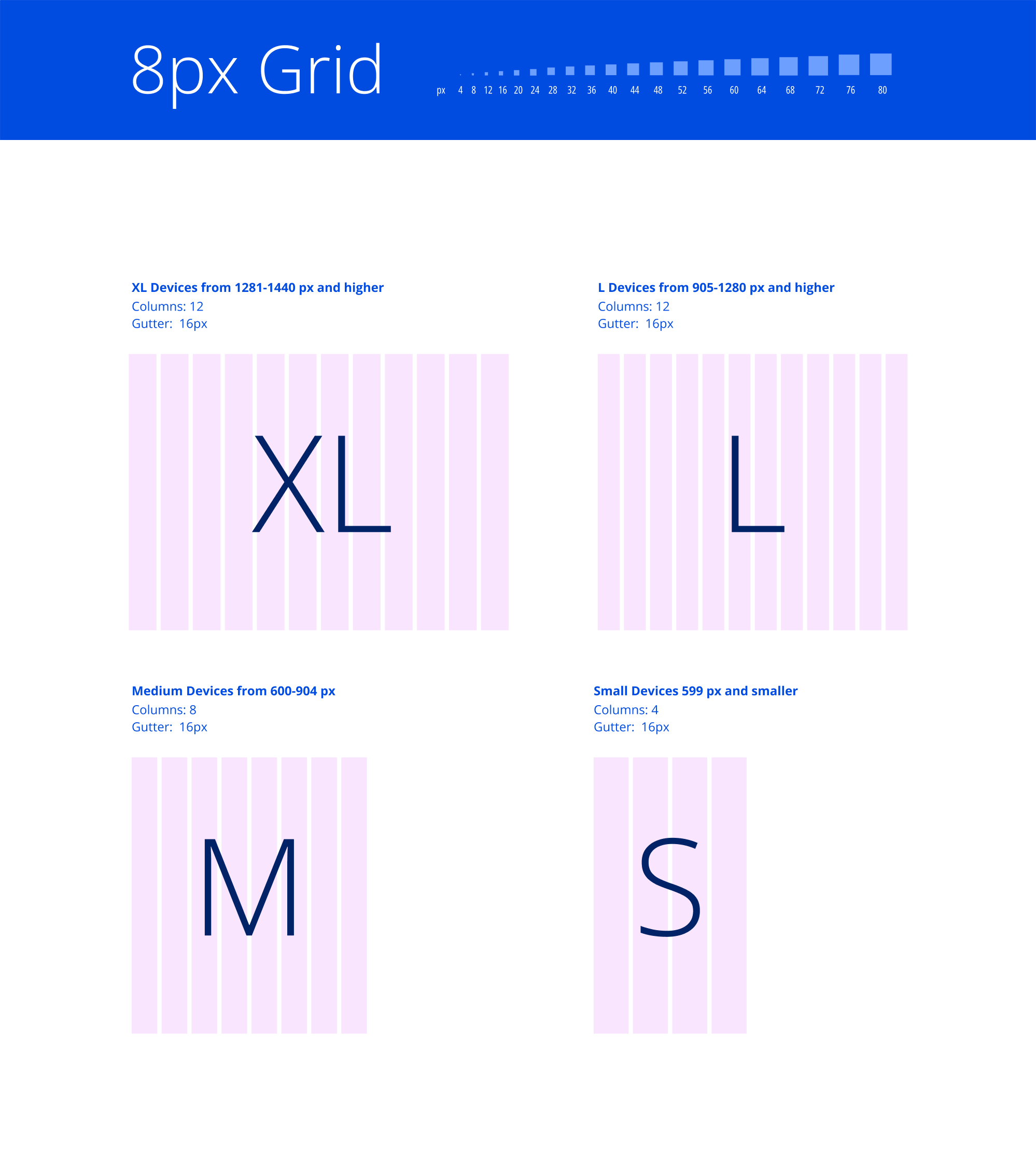
Colors, Typography, and Style Guide
This stage focused on defining the core visual elements of Relynk’s identity: the color palette, typography, and grid system.
By establishing these foundational guidelines, we created a style guide that ensures visual consistency and aligns the interface with the brand’s strategic, elegant, and collaborative essence.
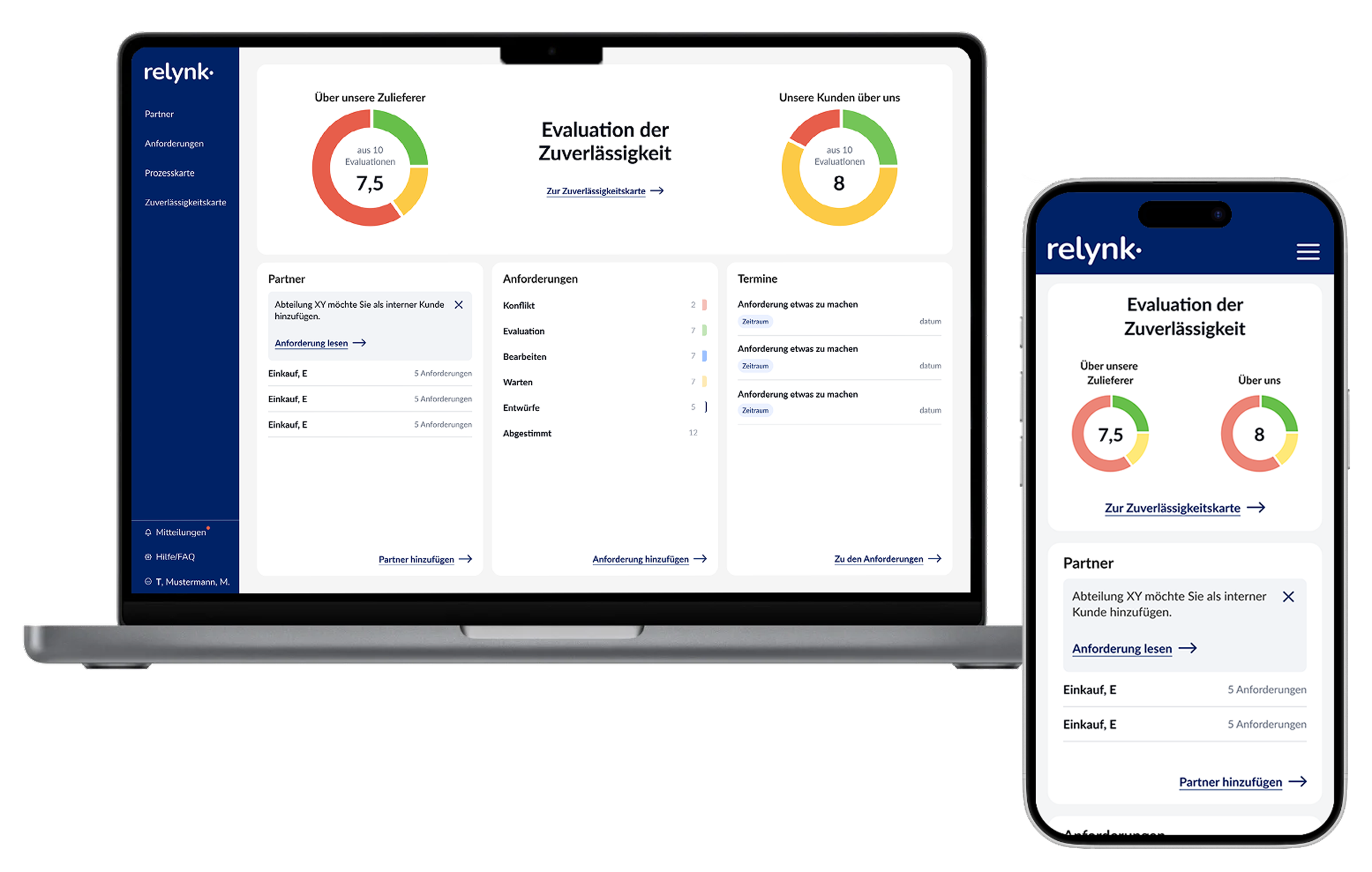
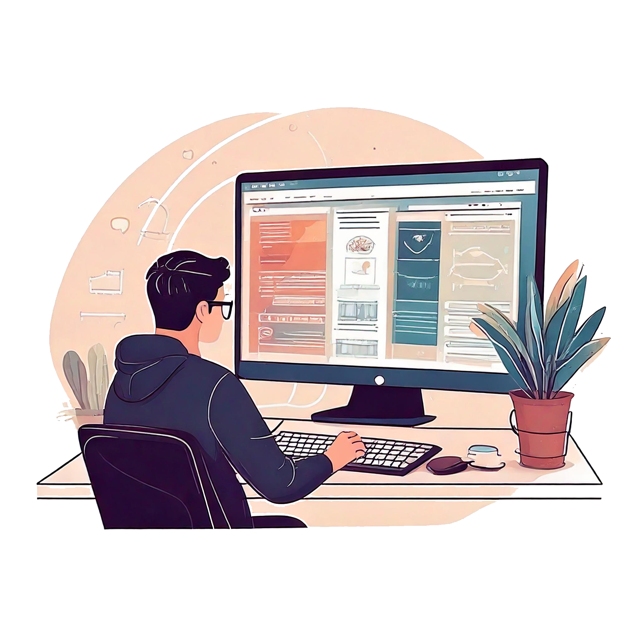
Based on user journeys, we developed initial wireframes to shape various aspects of the application and refine them iteratively. These wireframes were then transformed into prototypes, which we thoroughly reviewed and finalized.
This clear visualization gave developers a precise understanding of how the application should function and emphasized the core user experiences to prioritize.
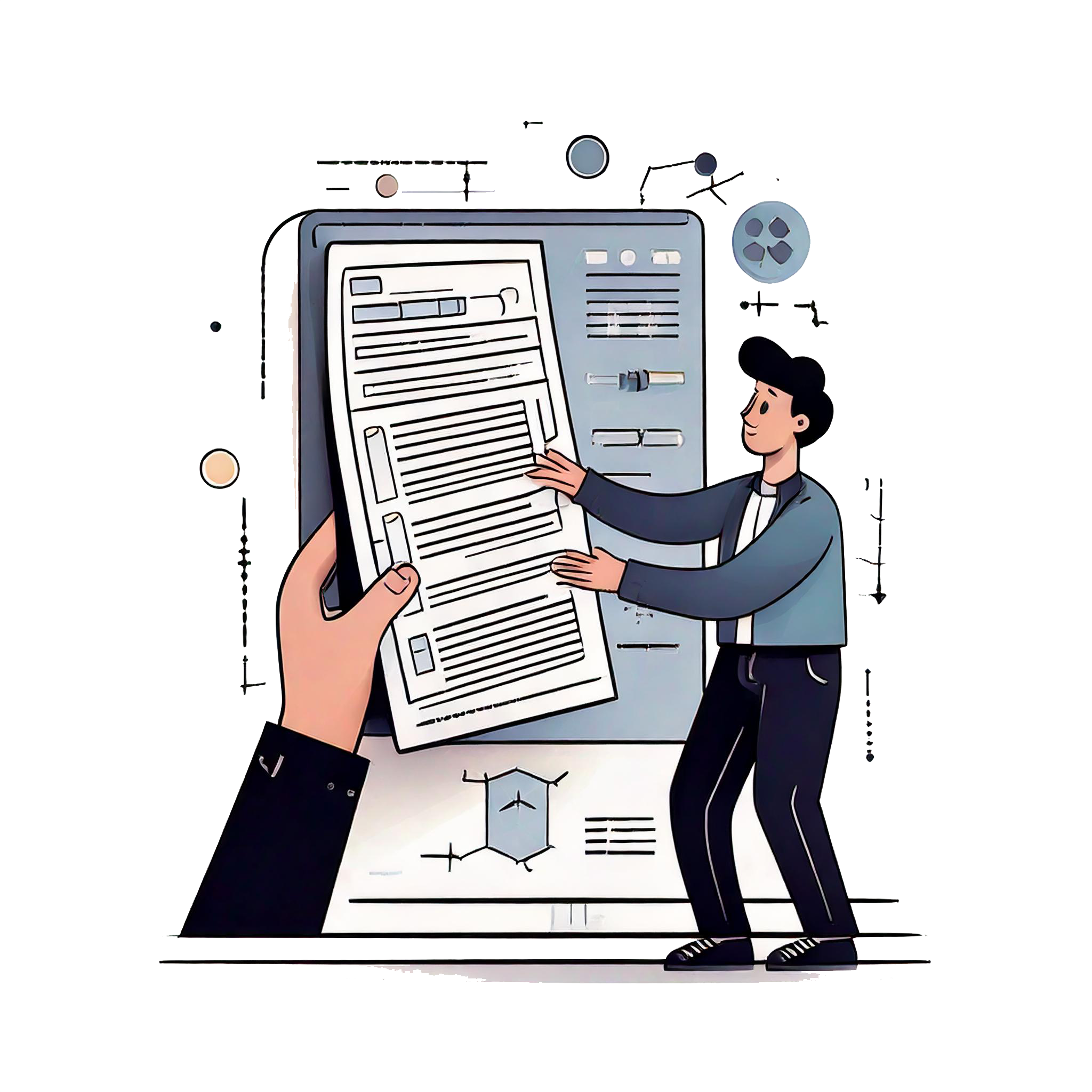
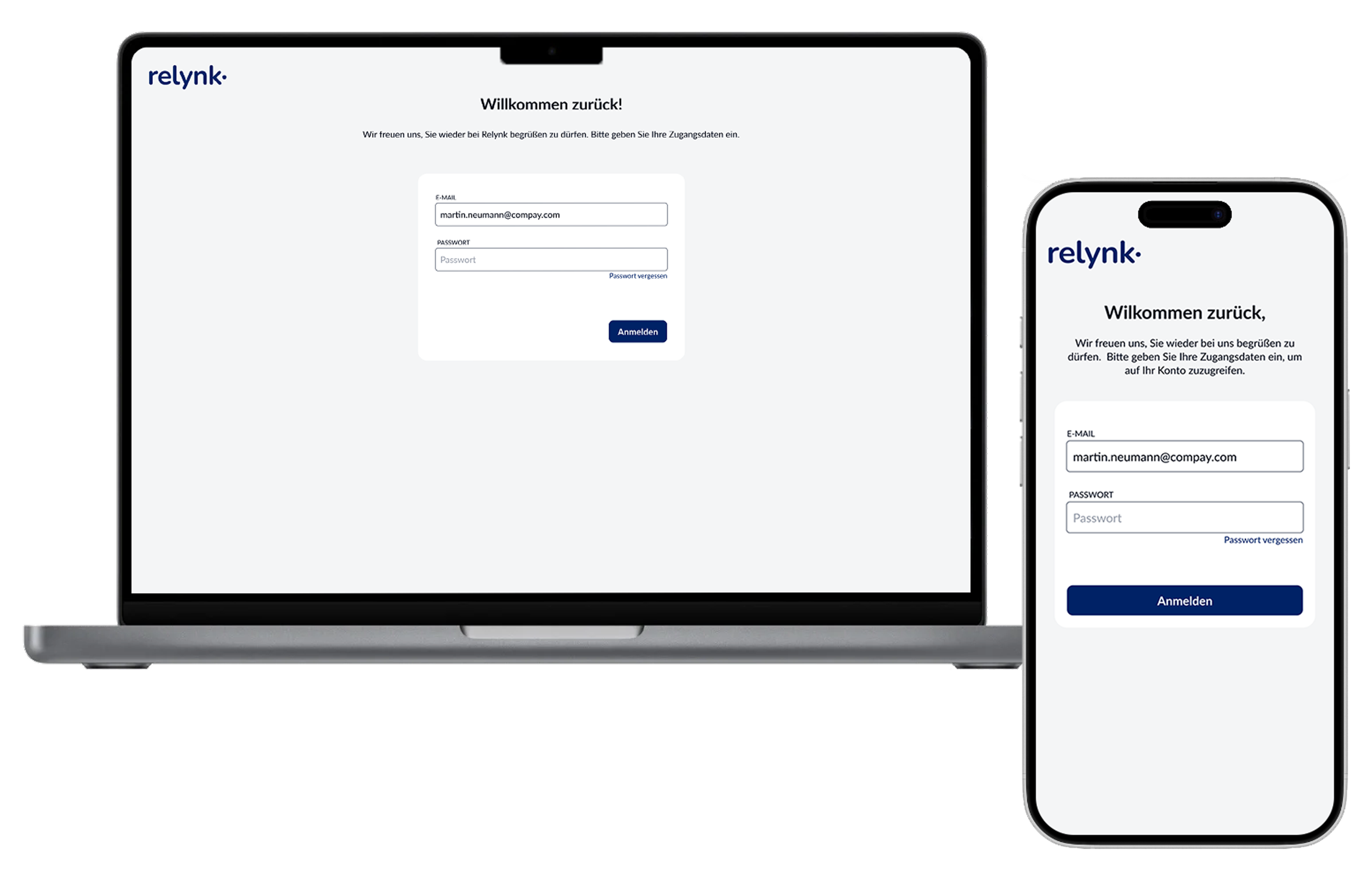
For the development handoff, a comprehensive design system was created to guide developers on implementing each component across various states, responsive sizes, and contexts.
Additionally, prototypes for all user journeys were provided, and regular meetings were held to review development progress, address challenges, and resolve outstanding questions. Clear communication and close collaboration were prioritized to ensure the product’s success.


The design language is a key driver of Relynk's success. Achieved in just 3 months.

Prof. Dr. Andreas von Schubert
Gründer & CEO Relynk GmbH