Three weeks
UX/UI/Product Designer
This project was requested by a client as a proposal during a three-week design sprint for the agency where I was employed. The client aimed to enter the wellbeing app market with a meditation platform to compete with established apps like Headspace. I played a key role in both the research and visual design phases, helping shape a compelling, user-centered experience.
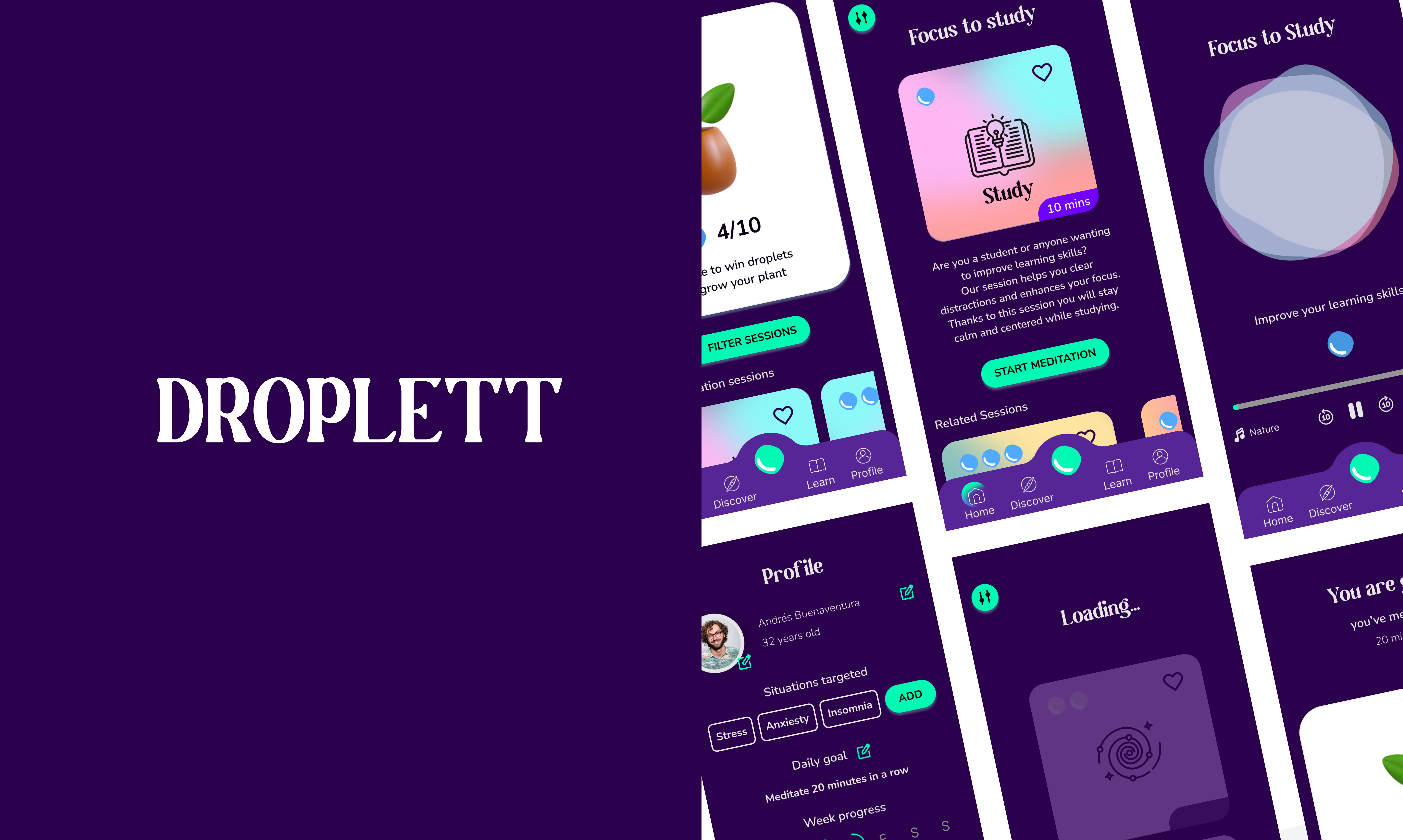
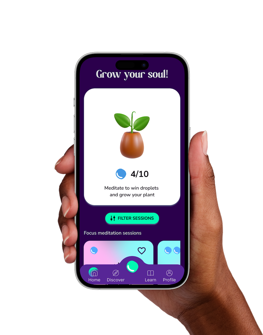
The app, Droplett, was crafted to help users cultivate a consistent mindfulness practice. It enables users to set meditation goals, track their progress, and receive personalized feedback, encouraging long-term engagement with their wellness journey.
Many users struggle to maintain a regular meditation practice. The goal was to create an app that encourages users to meditate more frequently by providing guidance, tools, and a personalized experience tailored to their meditation preferences.
In the research phase of the project, both qualitative and quantitative methods were utilized to gain insight into users’ meditation habits, pain points, and preferences.
Through secondary research, surveys, and user interviews, the research revealed that many users meditate at home, often using platforms like YouTube and Spotify. Common challenges included a lack of guidance, confusing interfaces, and distracting elements in existing apps. These insights informed the approach to designing a more intuitive and supportive meditation experience.
Quantitative research
For quantitative insights, secondary research was conducted using online sources, and a survey was administered to 52 participants to gather statistical data.
80% of users meditate at home, often using Spotify or YouTube.
Frequency of Meditation
Weekly (34%), Daily (32%).
Pain Points: Lack of guidance, inconvenient timers, distracting voices.
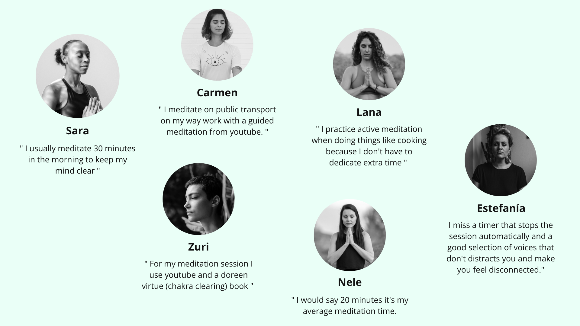
Qualitative research
To gain a deeper qualitative understanding, six potential users were interviewed to explore their behaviors and needs related to meditation.
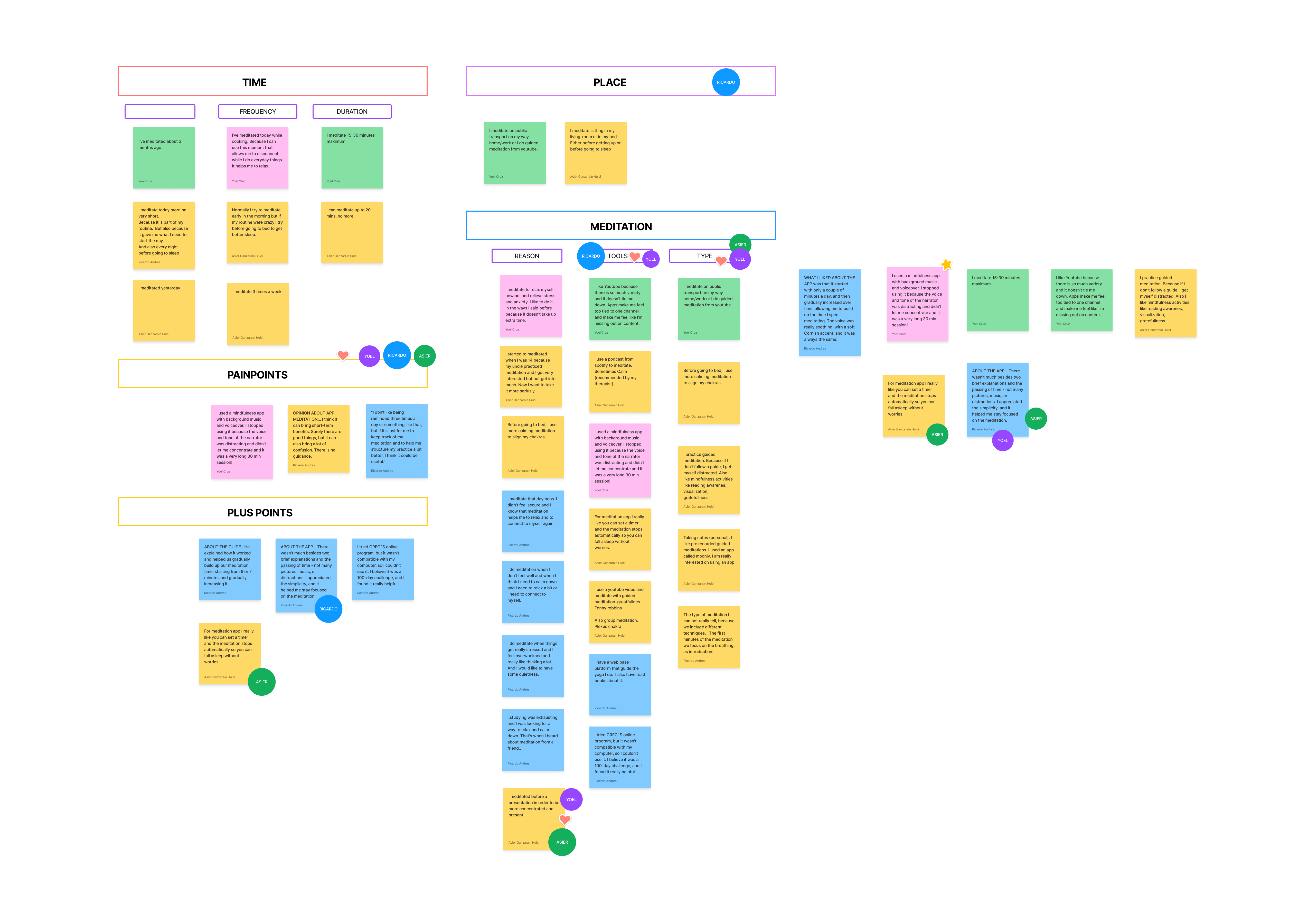
Affinity diagram &
Empathy map
The user research data helped identify patterns and trends, which were organized into an affinity diagram and empathy map to visualize connections between different ideas.
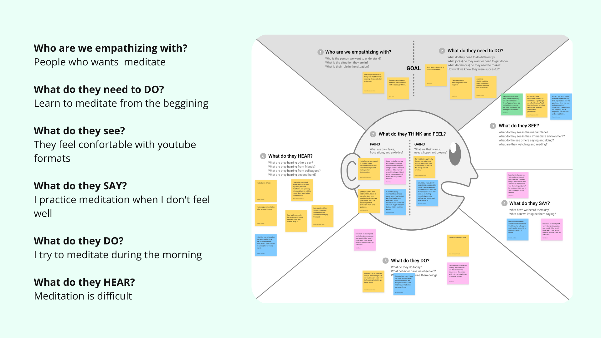
To better understand the users’ thoughts, feelings, and actions, an empathy map was created using the research data.
User persona & Journey map
Through analysis of this diagram, a detailed user persona and journey map were constructed to understand how the ideal user would interact with the product or service.
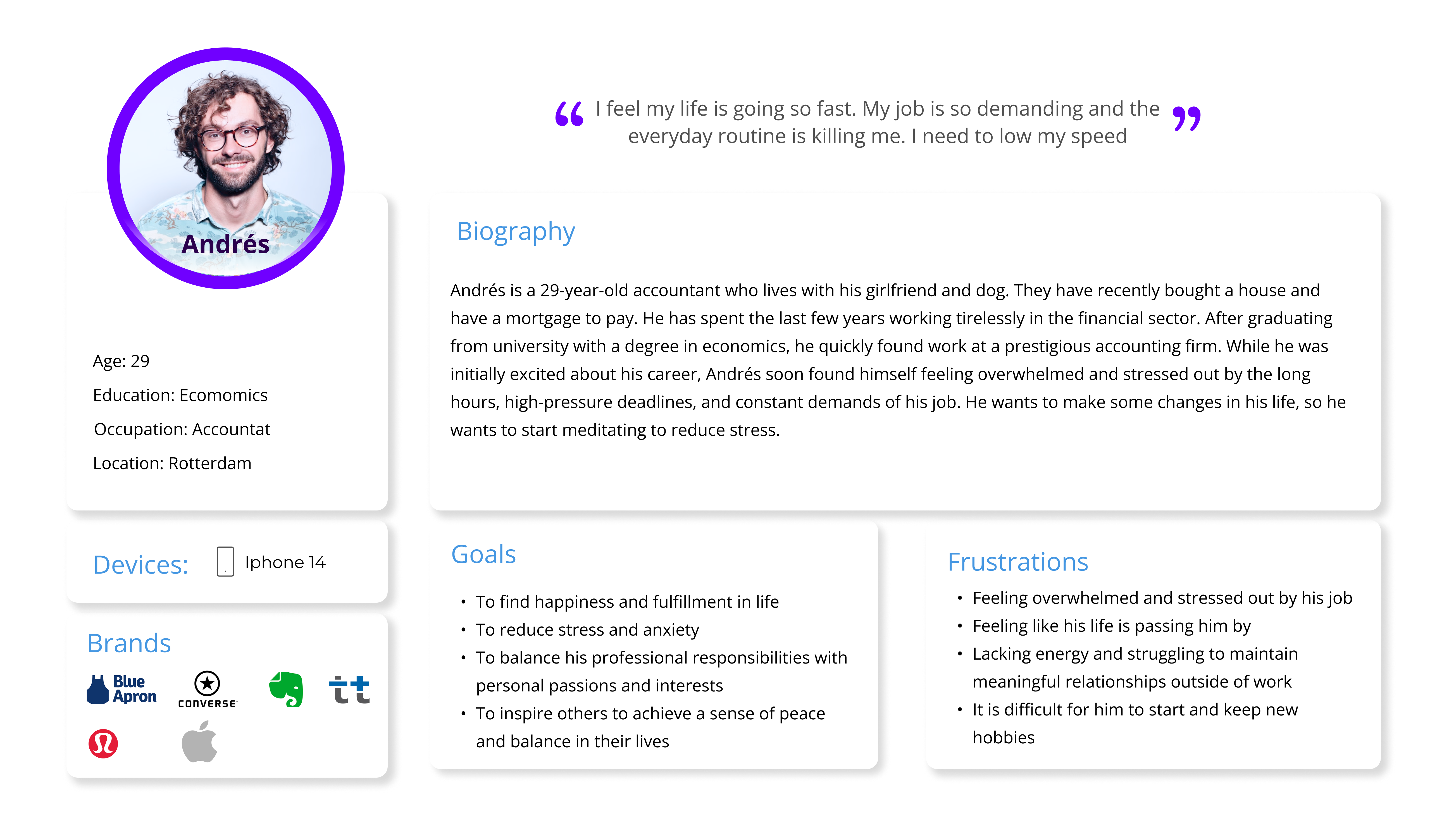
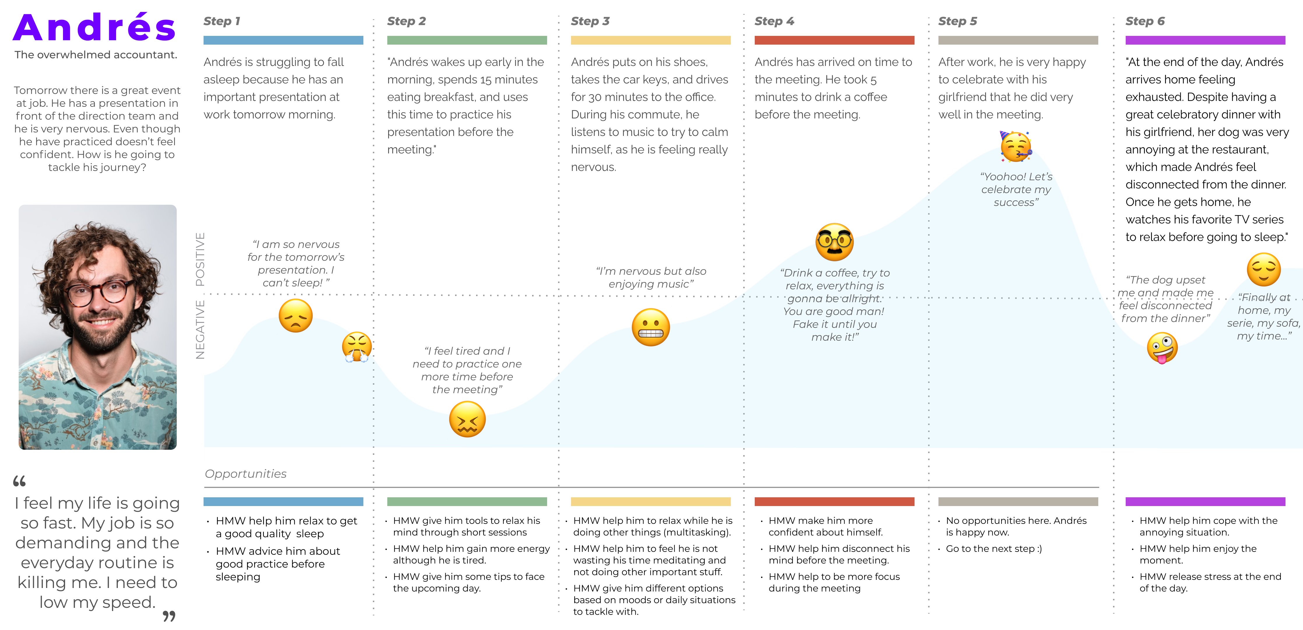
In the Define phase, the focus was on identifying the core needs of the target users—busy, middle-aged workers seeking ways to manage their mental well-being through meditation.
The developed problem statement highlighted their desire to be more present and relaxed in life, using meditation to address everyday stressors. This guided the design focus on creating a tool that offers accessible, practical solutions for users to engage in meditation while balancing their hectic schedules.
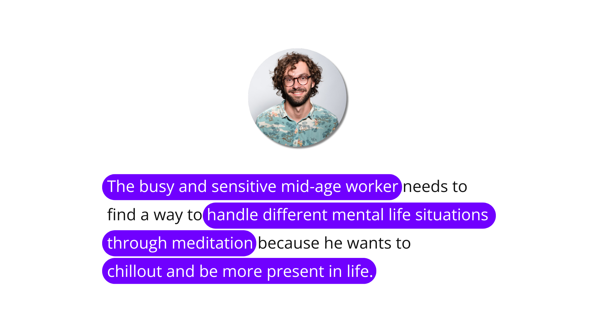
Redefinition of the problem statement
The problem statement was reformulated based on research findings, reflecting users’ need for a flexible, guided meditation tool that fits into their busy schedules and addresses the challenges identified during the research phase.
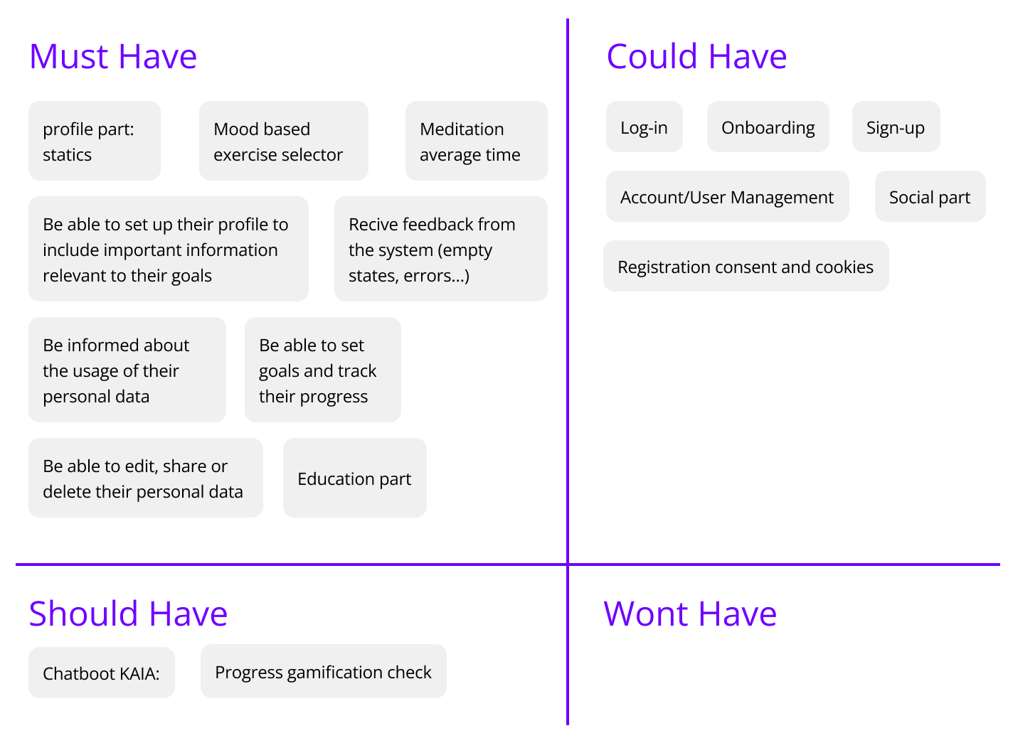
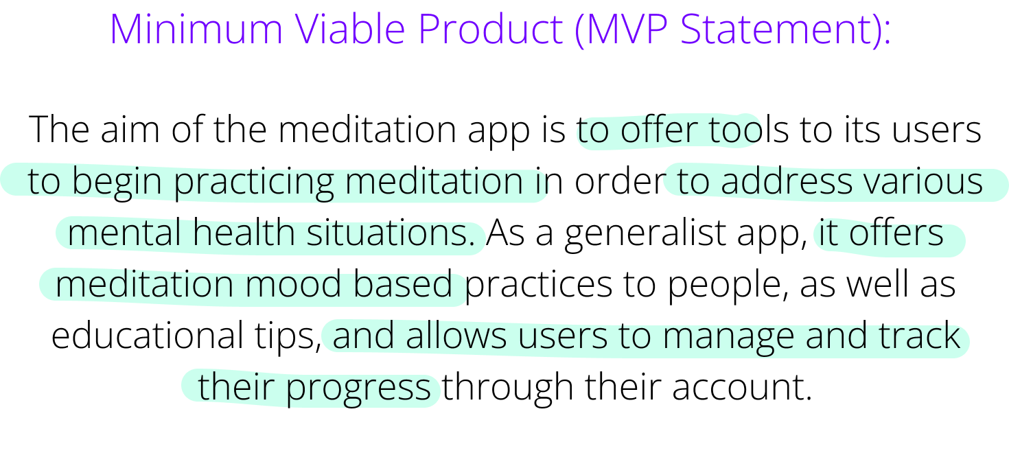
Moscow method & MVP
The MoSCoW method was used to prioritize essential features, focusing on must-have functionalities such as meditation tracking and user personalization.
Based on the research findings and MoSCoW results, the MVP was then generated to ensure it addressed key user needs, including flexibility, guided sessions, and progress tracking.a
User-Centric Flow Mapping
The app’s architecture was initiated with a user flow happy path, based on the MVP and prior research findings, ensuring a seamless and intuitive user journey through key features like meditation tracking and personalization.
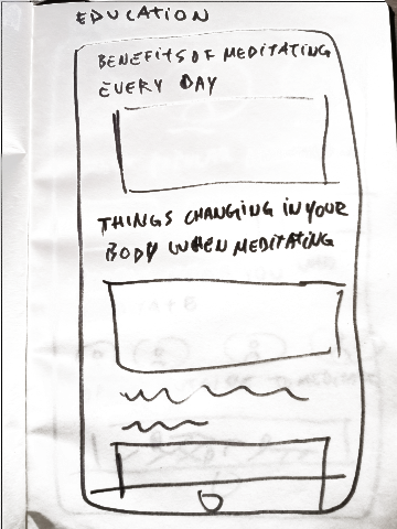
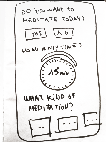
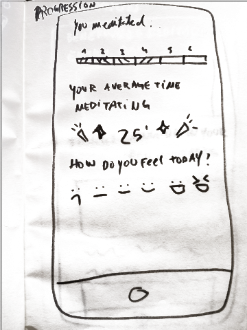
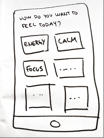
In the Ideation phase, we used techniques like “Crazy 8’s” and concept sketching to rapidly brainstorm design solutions. The resulting concepts focused on simplifying the meditation process, improving session selection, and creating a more intuitive navigation based on user needs identified in the research phase.
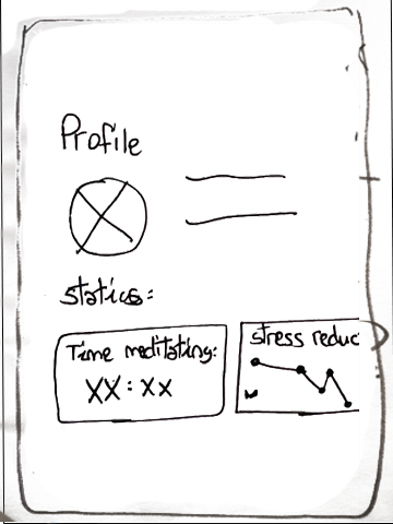
In the Prototype phase, low-fidelity and mid-fidelity prototypes were developed and tested to refine the app’s functionality.
User feedback helped identify improvements, such as clarifying the search field and enhancing meditation session filters, ensuring the app remained intuitive and user-friendly.
Testing Low-Fidelity Wireframes
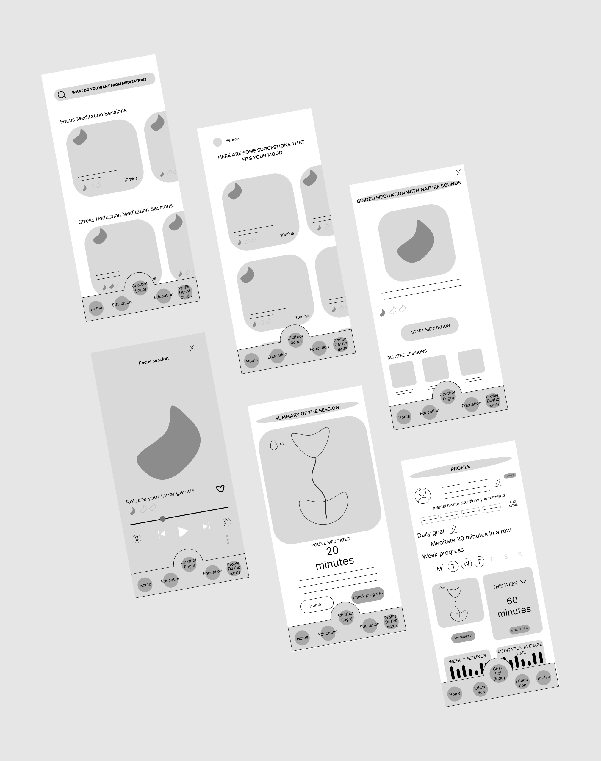
Findings
+The users found the meditation search function unclear or difficult to use.
+At the beginning of the application, the concept of personal growth and inner development was not immediately clear or accessible.
+However, the user's feedback was valuable and will help us refine the application's design and user experience.
Testing Mid-Fidelity Wireframes
Findings
+When filtering meditation sessions by time, consider expanding the available options to include a wider range.
+On the app's home screen, provide clearer and more user-friendly instructions on how the app works.
+The icons and information in the player settings should be more consistent and easier to understand.
+Finally, reorganize the profile frame layout for better hierarchy and clarity.
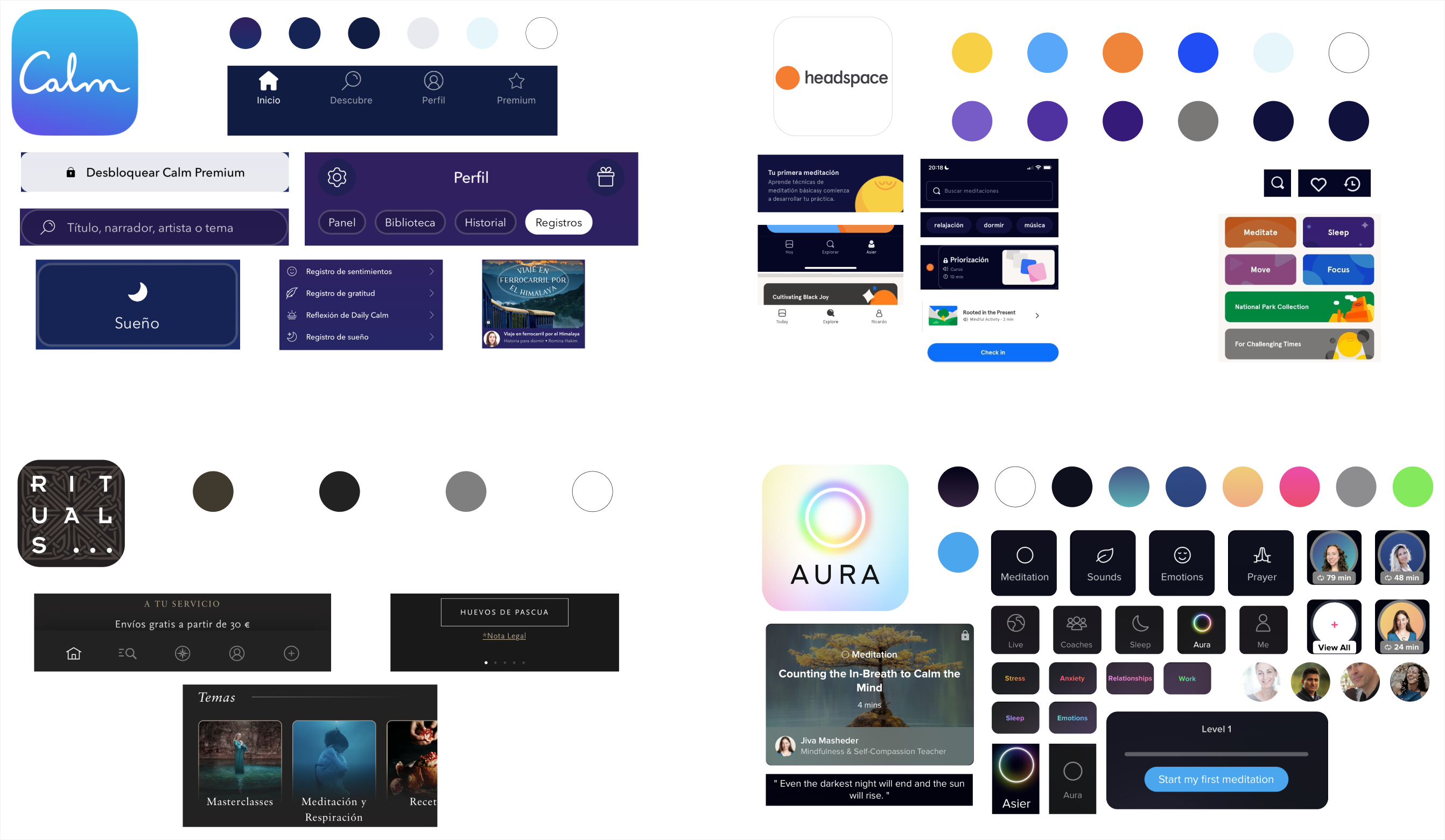
In the Visual and UI Design phase, a Visual Competitor Analysis was conducted to assess industry standards and trends. From this, the app’s Brand Attributes were defined as fluid, playful, inclusive, relaxing, and self-care oriented. A Moodboard was then created to inspire the visual style tile, followed by the selection of vibrant colors, clean typography, and a cohesive style tile that reinforced the app’s user-friendly aesthetic.
Visual Competitor Analysis
The Visual Competitor Analysis shows the importance of certain colors, clear navigation, and personalization. Competitors like Calm and Aura focus on simplicity, while Headspace uses playful visuals, and Rituals opts for a premium feel, all highlighting key elements for Droplett’s design.
Brand Attributes and Moodboard
To establish a consistent visual identity for Droplett, key Brand Attributes were defined as fluid, playful, inclusive, relaxing, and self-care focused. These attributes aligned with user needs for a calming and supportive experience. A Moodboard was created to visually express these qualities, ensuring that every design decision would evoke the attributes and guide the app’s overall aesthetic, reinforcing the brand’s core values throughout the user experience.
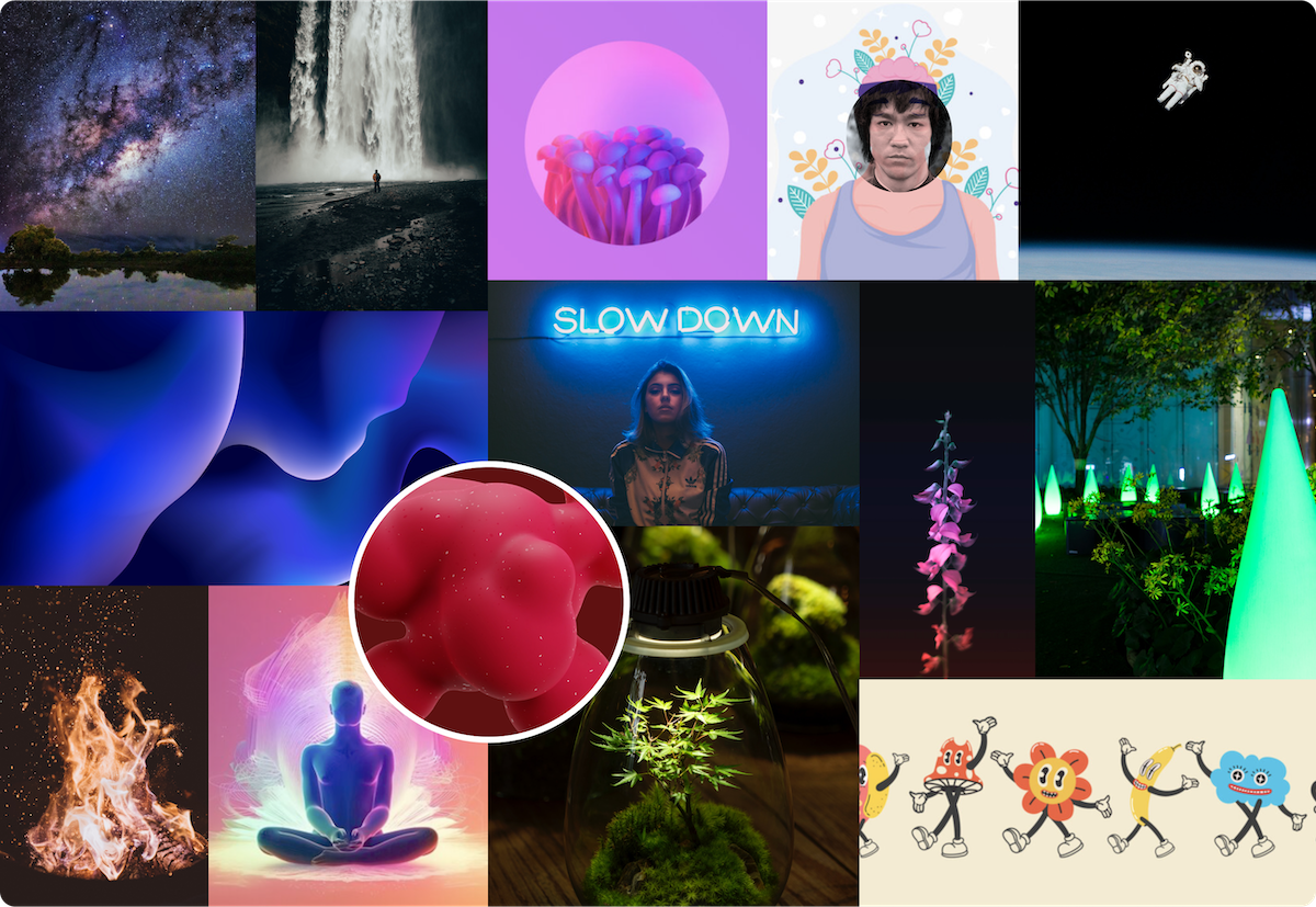
Fluid
Playful
Inclusive
Relaxing
Selfcare
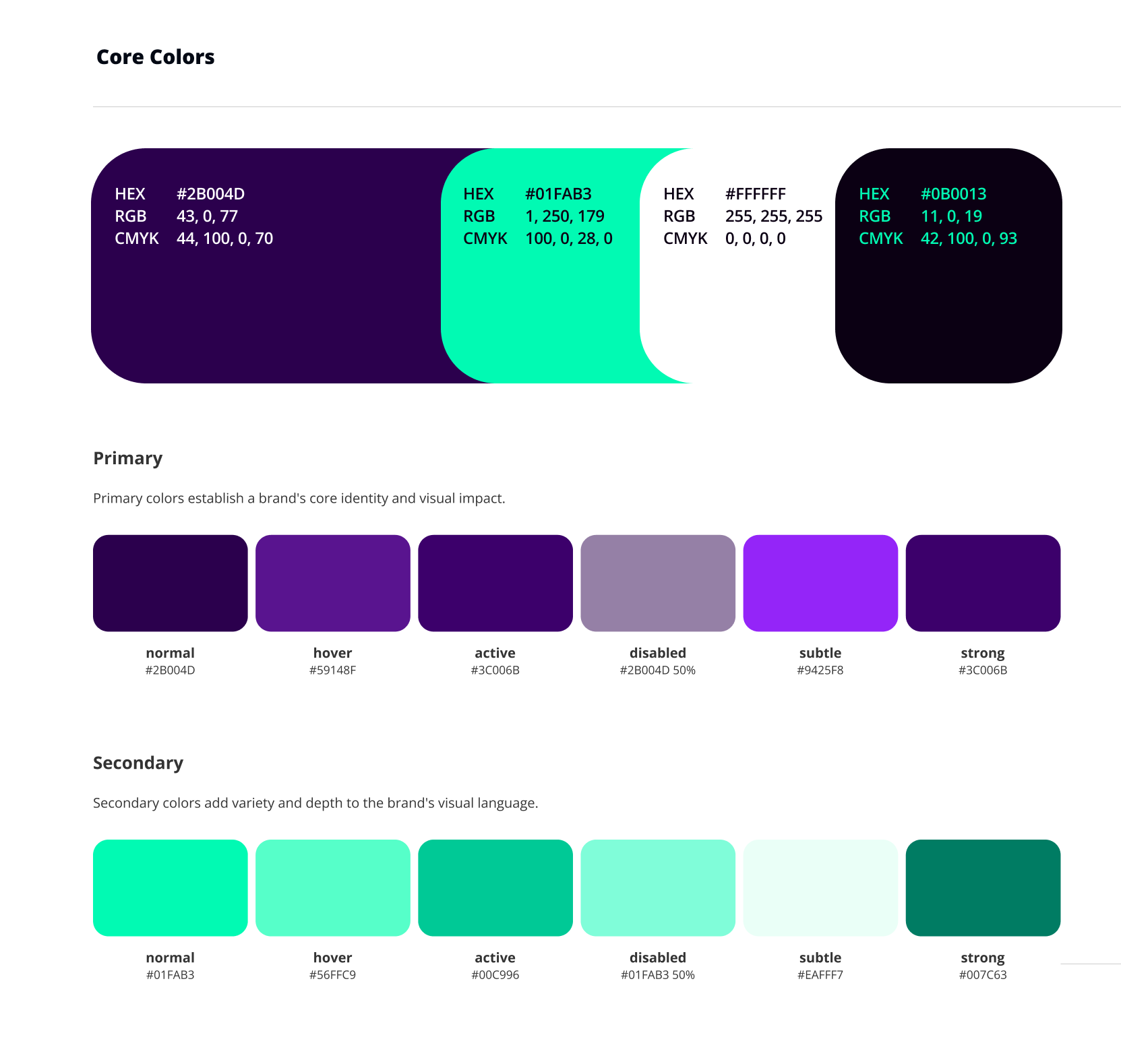
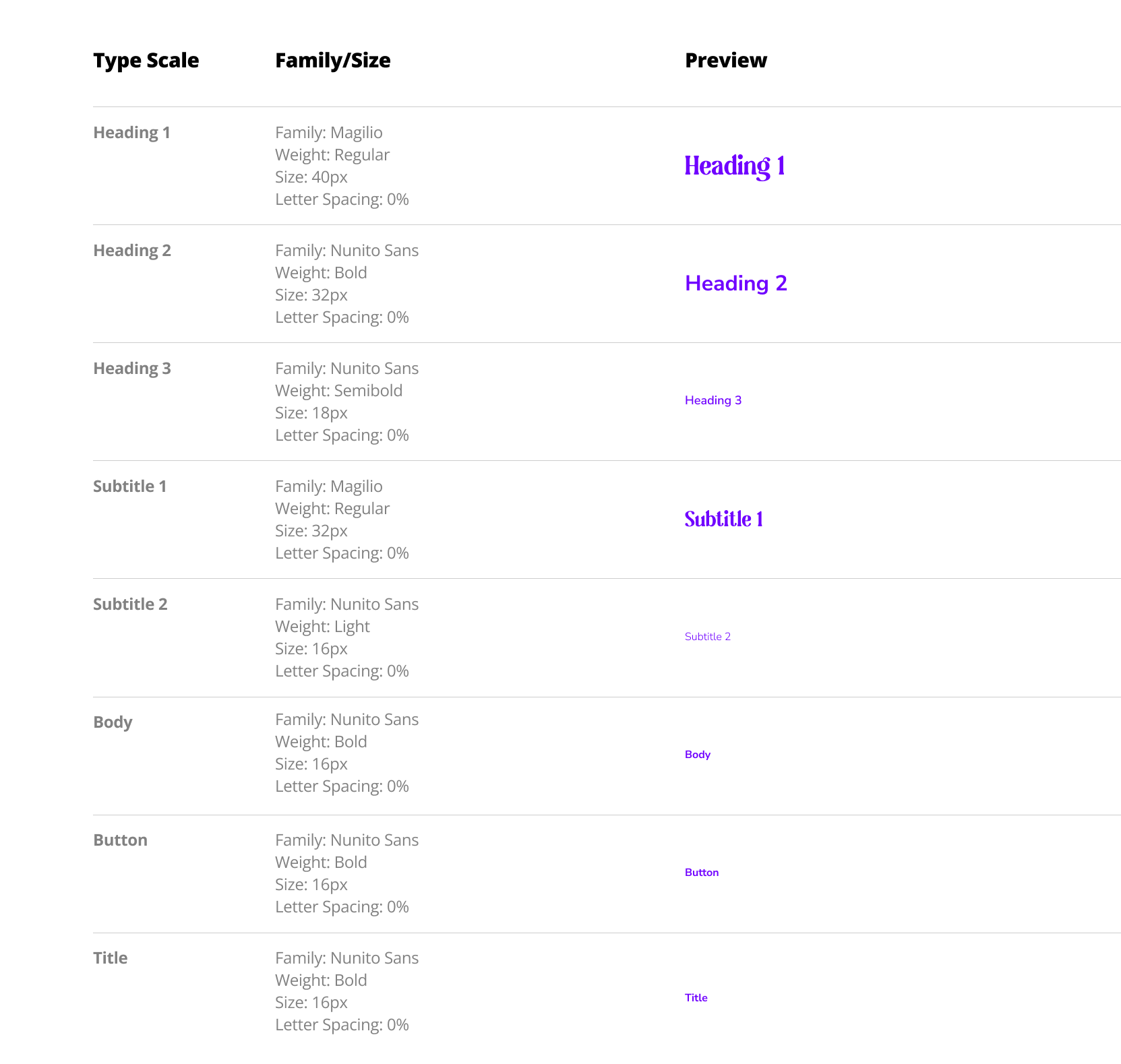
Colors, Typography, and Style Tile
In the Colors, Typography, and Style Tile, a vibrant palette of deep purples, blues, and greens was selected to establish Droplett’s core identity, complemented by the fonts Nunito Sans and Magilio for their readability and friendly, approachable appearance. These elements were designed to create a visually consistent and calming interface, reinforcing the app’s focus on relaxation and mindfulness.
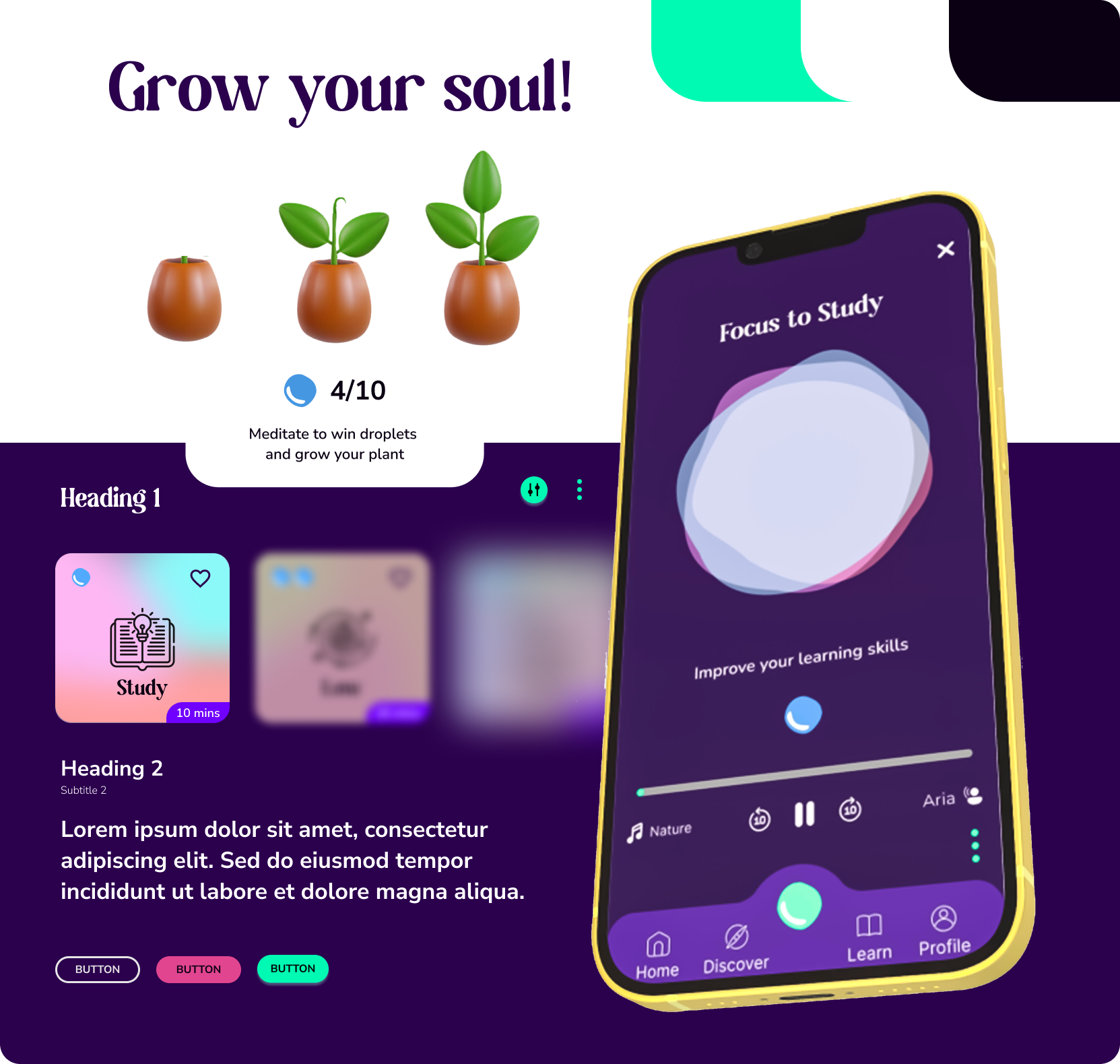
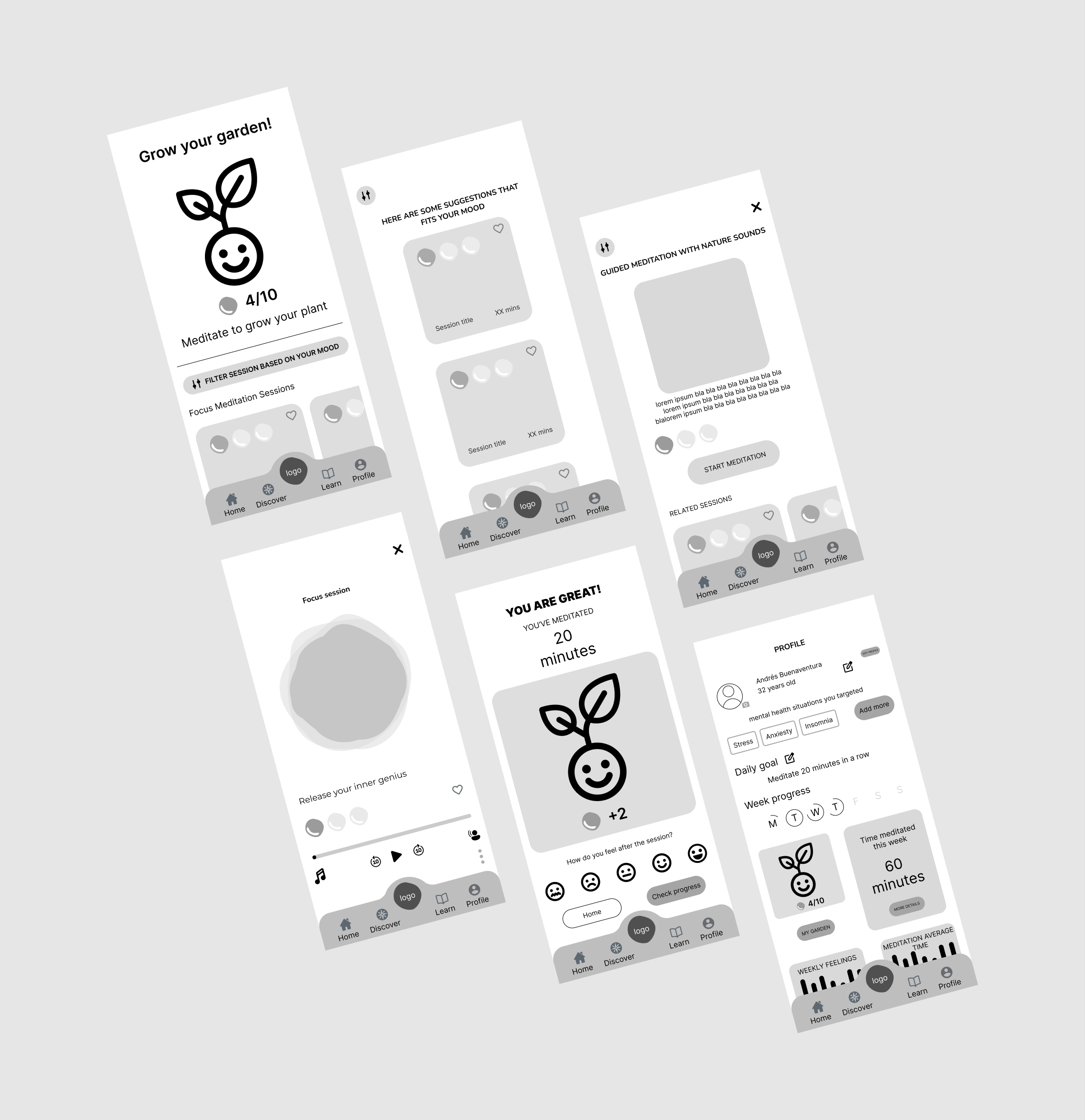
The high-fidelity prototype of Droplett provides a refined visual representation of the app, showcasing key interactions such as the loading screen, error states, and user profile. It highlights a cohesive and branded user interface with bold color contrasts—deep purples paired with bright teal accents—reflecting the brand’s core identity.
The prototype demonstrates the app’s core functionality and visual language, offering users an intuitive and engaging meditation experience through features like daily progress tracking and session filtering. Key states like error handling and blank screens are designed with user-friendly feedback to guide them through the app seamlessly.