Three weeks
UX/UI Product Designer – Responsible for research, prototyping, usability testing, and final design.
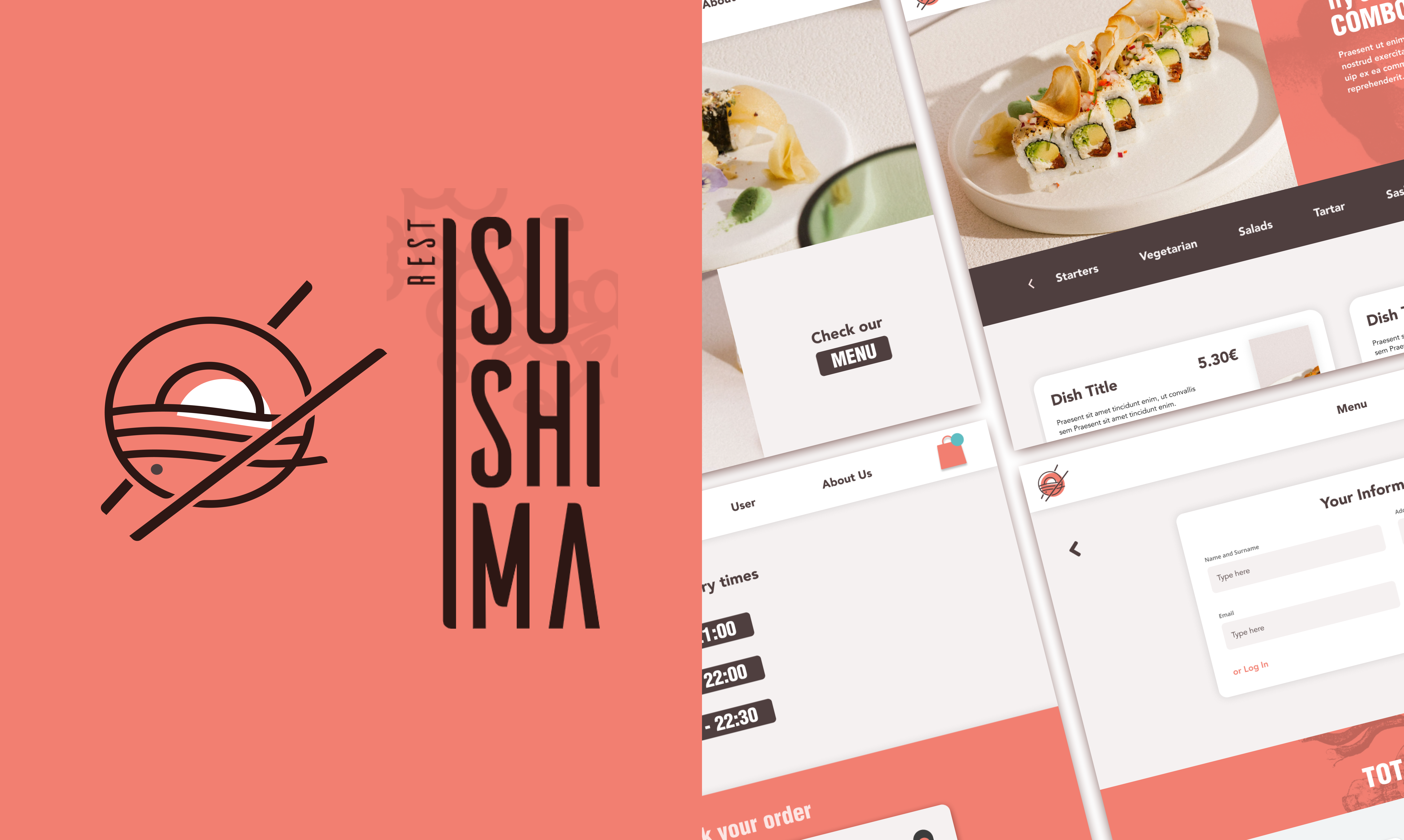
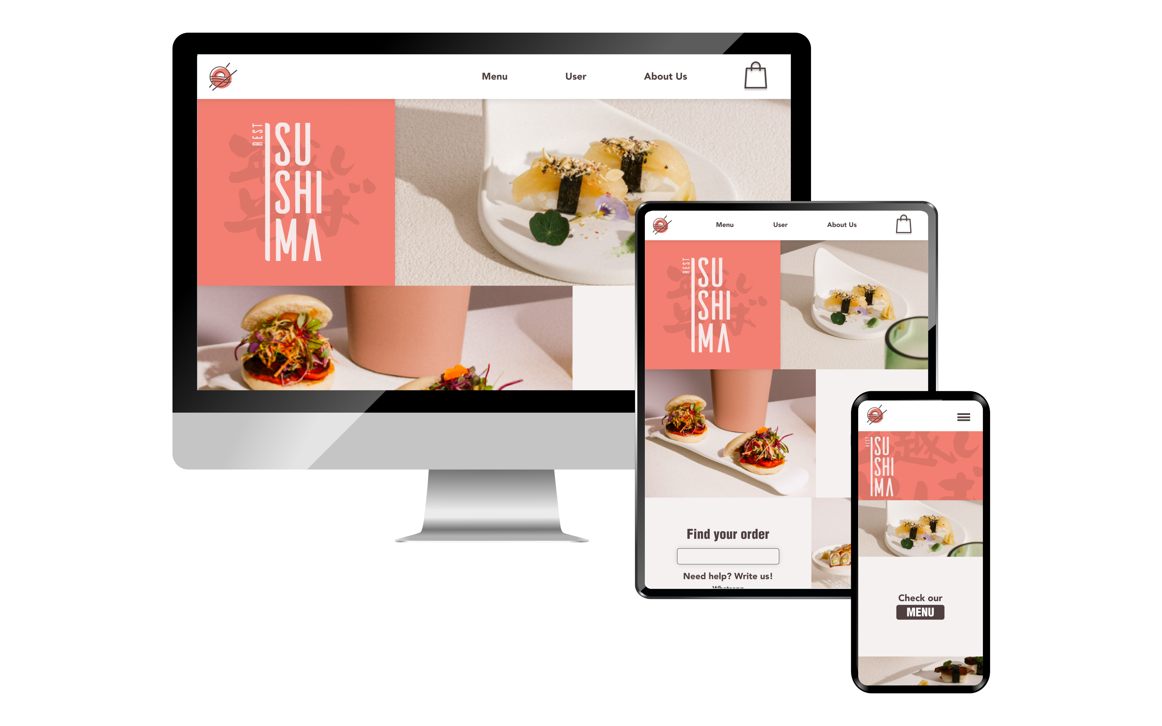
This case study explores the redesign of the Sushima Restaurant website, a high-quality sushi delivery and pick-up service located in Xativa, Spain. The project, focuses on improving the user experience by addressing pain points such as limited delivery options, lack of visual content, and poor time management. Through competitive analysis, user interviews, and prototyping, the redesign aims to create a more user-friendly and efficient platform, enhancing customer satisfaction and operational efficiency.
Sushima Restaurant’s outdated website lacked home delivery options, visual content, and efficient order management, leading to blocked orders and reliance on third-party apps. The redesign aimed to create a user-friendly platform, streamline operations, and enhance customer satisfaction.


The research phase began with a competitive analysis of local and international sushi restaurants, identifying gaps in Sushima’s current offering.
User interviews revealed key pain points, such as the lack of delivery options, poor time management, and the absence of visual content like photos and promotions.
Stakeholder insights highlighted operational challenges, including a small kitchen space and over-reliance on third-party apps.
Affinity diagrams and mental maps were used to organize findings, uncovering opportunities to improve usability, trust, and customer engagement through a redesigned website.

In the Define phase, we transformed raw research data into actionable insights. We focused on understanding our target user's journey, identifying key pain points, and crafting a precise problem statement.
This user-centric approach guided the definition of core features and functionalities, aligning with both user needs and stakeholder goals. We then mapped out a modular sitemap and user workflows, ensuring a solid foundation for the creative exploration in the Ideation phase.


Page in construction